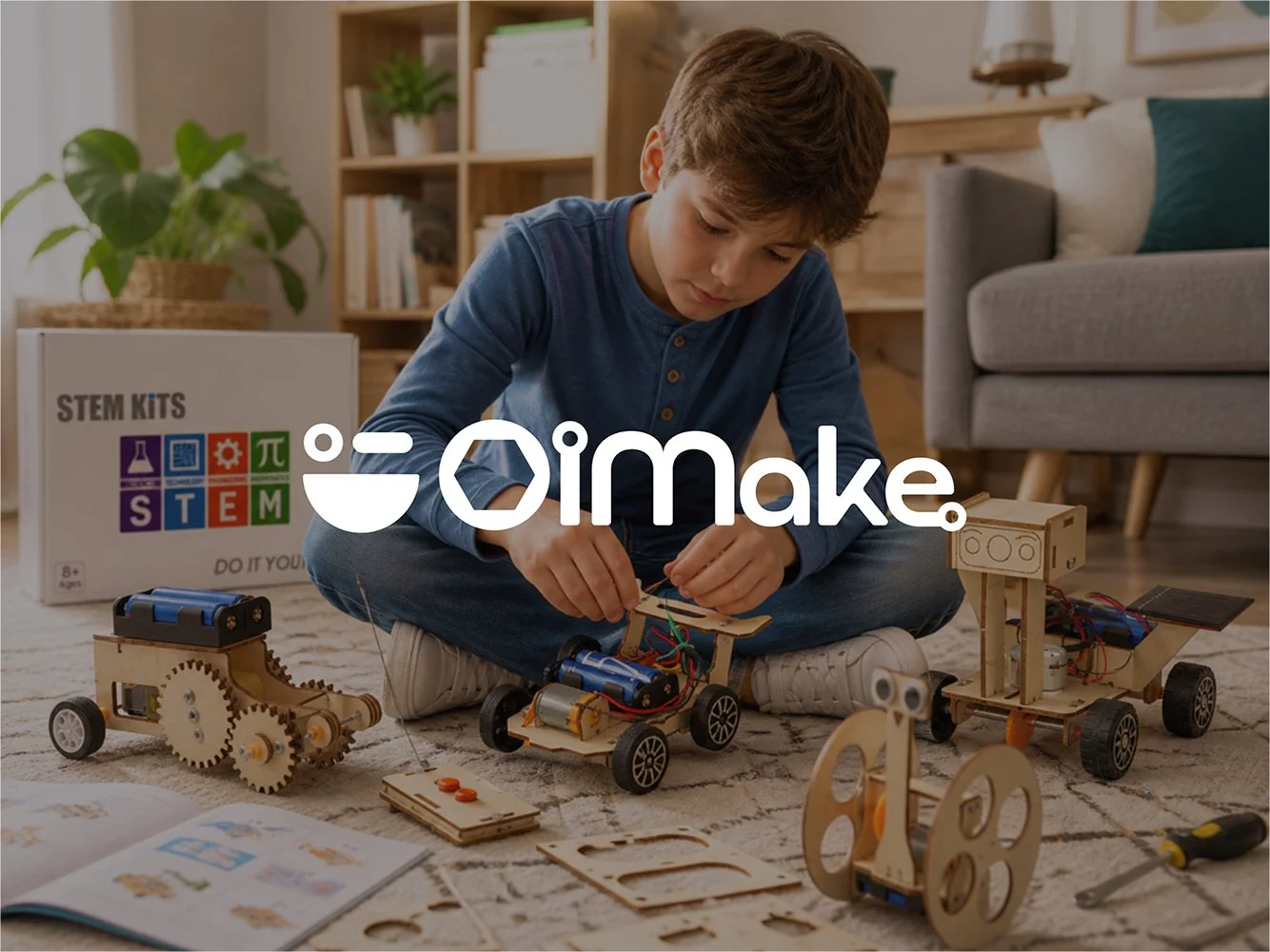
OI Make - Branding & Identity Design Project
OIMake is a modern DIY STEM maker brand designed to inspire children through hands-on, screen-free learning experiences. Built around the idea of “Technology Made Buildable,” the brand identity combines playful geometry, modular design systems, and contemporary visual storytelling to create a future-ready educational ecosystem. This branding project focused on developing a scalable identity that bridges creativity, engineering, and learning while appealing to both children and parents. From logo construction and typography systems to social media aesthetics and digital applications, the OIMake identity was crafted to position the brand as a leader in the evolving STEM education and maker culture space in India.

August Modern Diner - Branding & Identity Design Project
The project focused on building a cohesive visual and verbal identity system that reflects warmth, familiarity, and a premium yet approachable dining experience.