Back2fitt
Project Type - Brand Refresh
Team - Awesome Sauce Creative
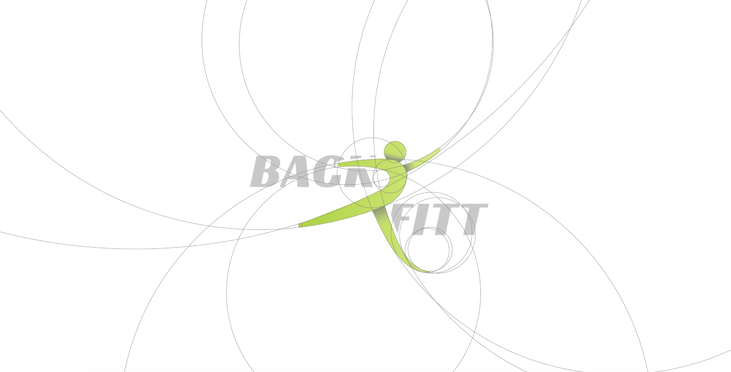
At the core of Back2Fitt’s brand refresh lies a commitment to movement, health, and transformation—all captured through a minimalist yet dynamic visual identity. The newly crafted logo, featuring a stylized human figure in motion formed by abstract green lines and circles, instantly conveys agility, vitality, and balance—qualities essential to a brand rooted in fitness and wellness.
Why This Works
Visual Storytelling: It elaborates on how the logo’s form (curved lines, circles) visually communicates the brand ethos—movement and balance—while the text anchor “BACK TO FIT” grounds it in intention and direction.
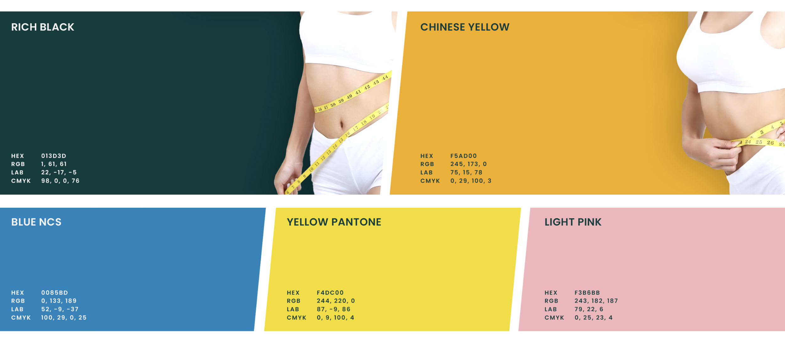
Color Psychology: The green tone aligns with notions of health, renewal, and calmness—reinforcing the brand’s positioning in the wellness space.
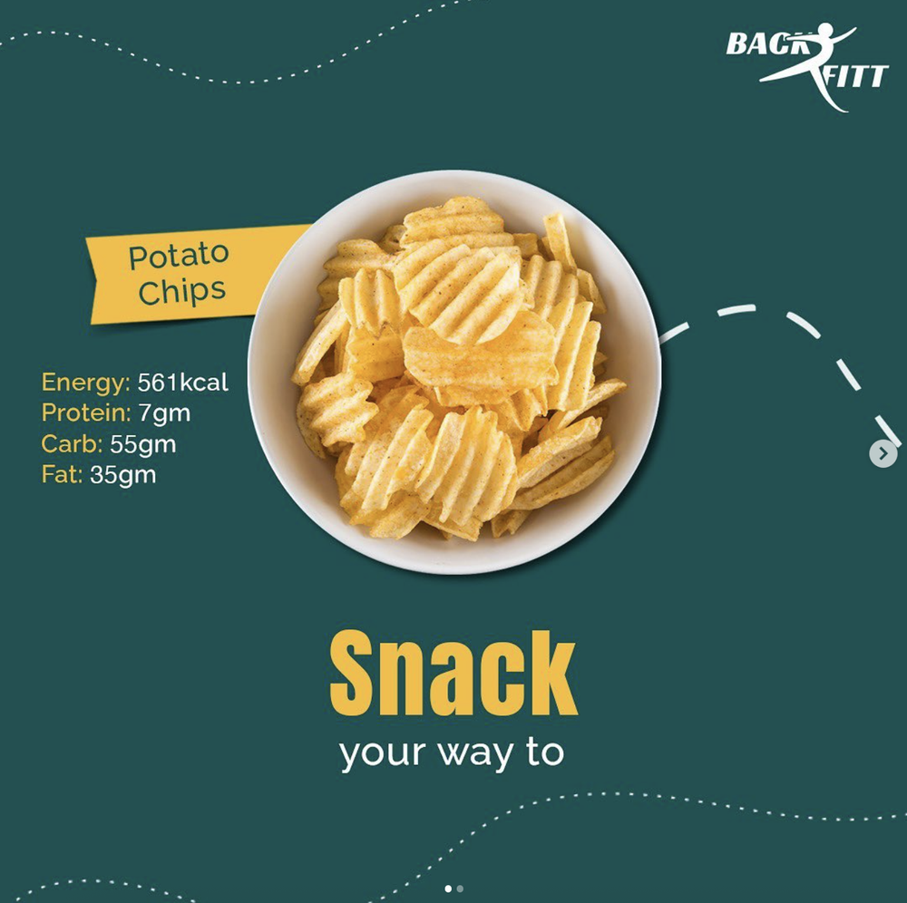
Brand Tone: Framing the identity as “approachable yet aspirational” helps position Back2Fitt as both relatable and motivating—a key balance for fitness brands.


