

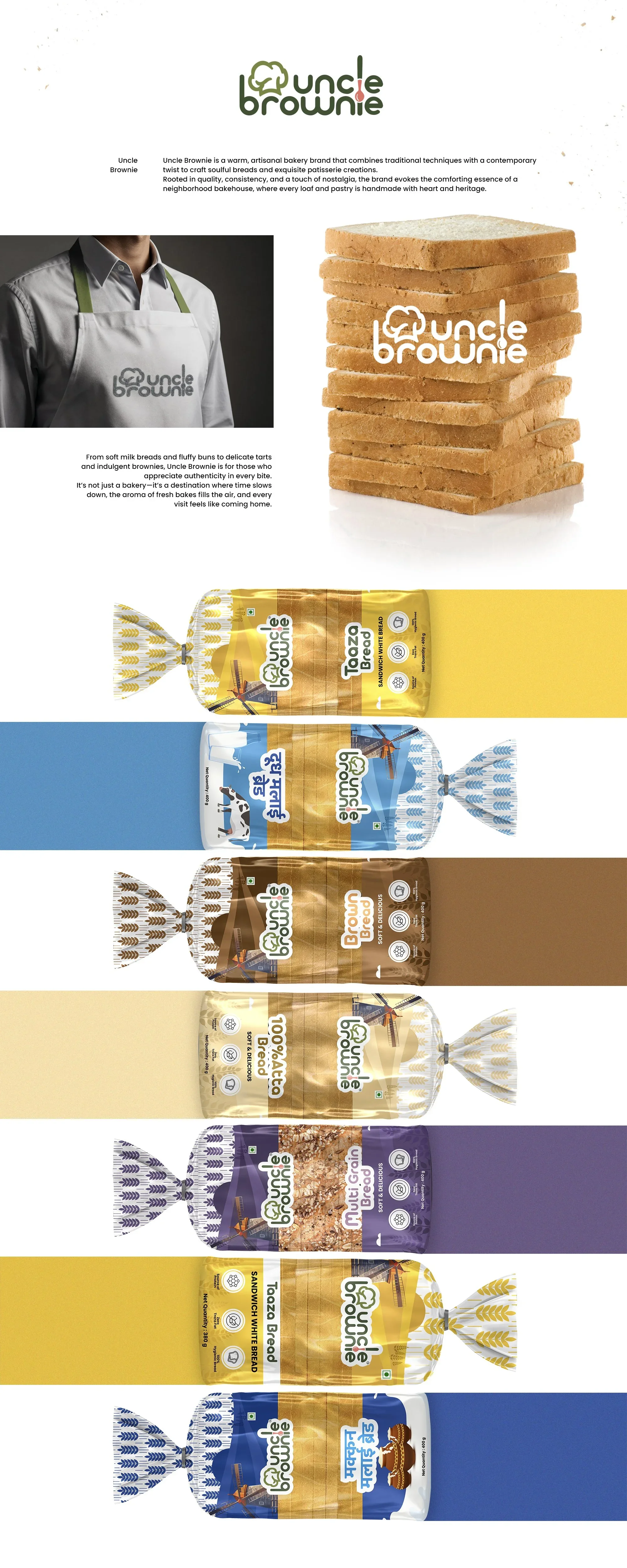
Uncle Brownie Breads
Project Type - Packaging Design
Team - Awesome Sauce Creative
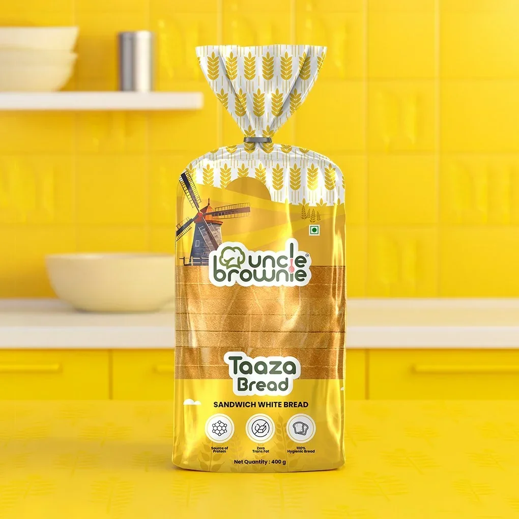
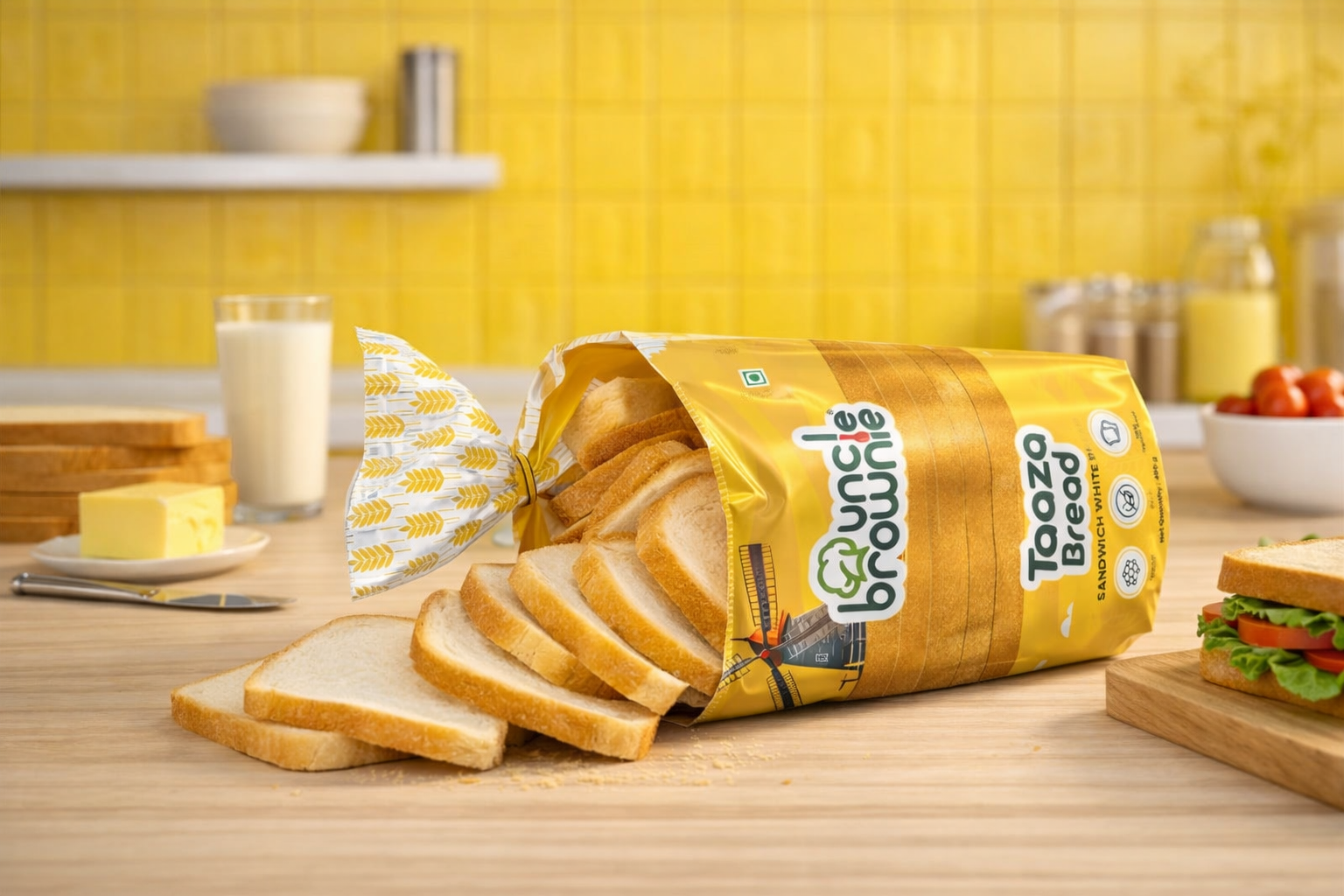
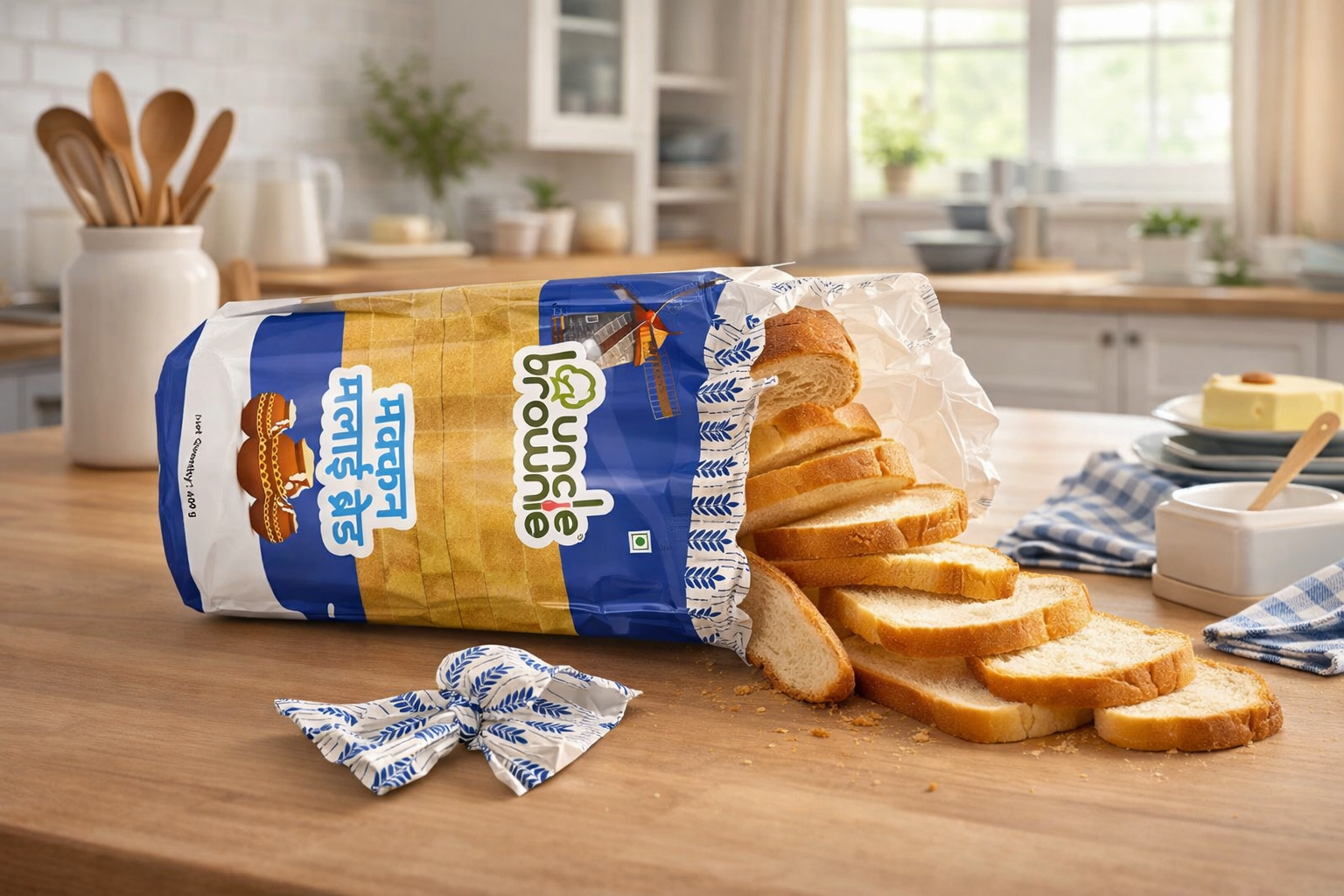
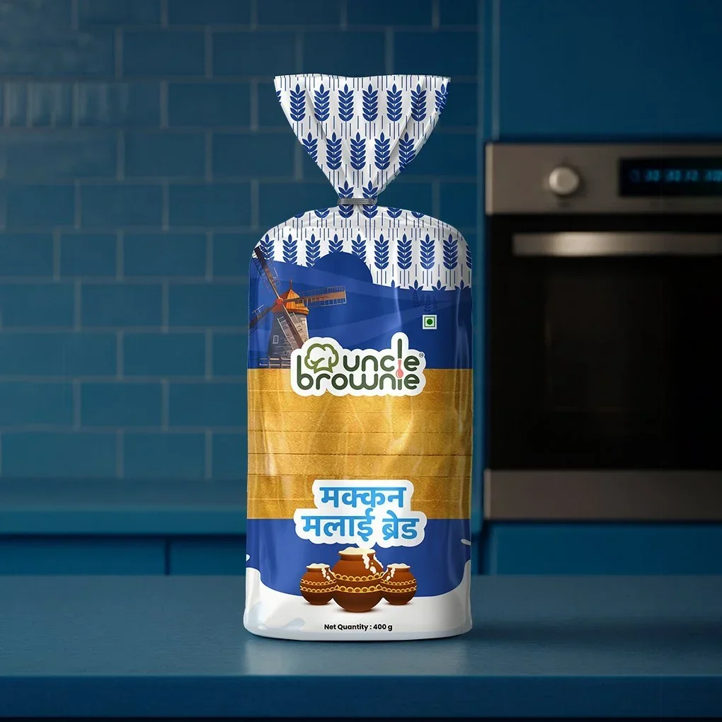
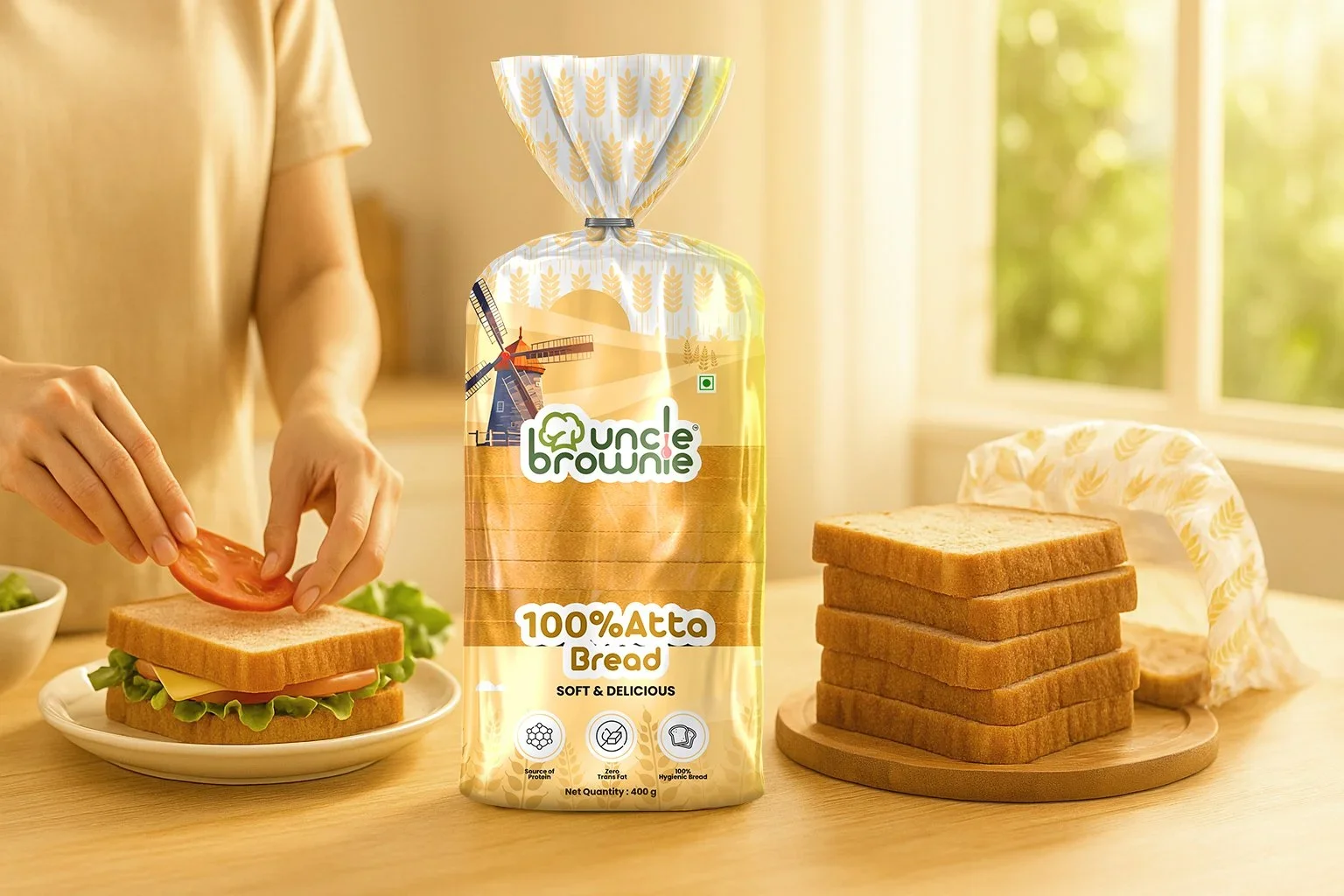
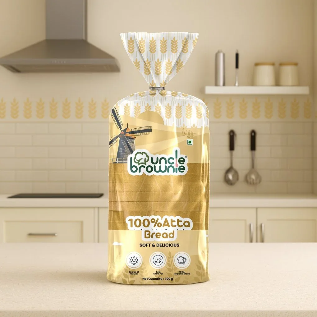
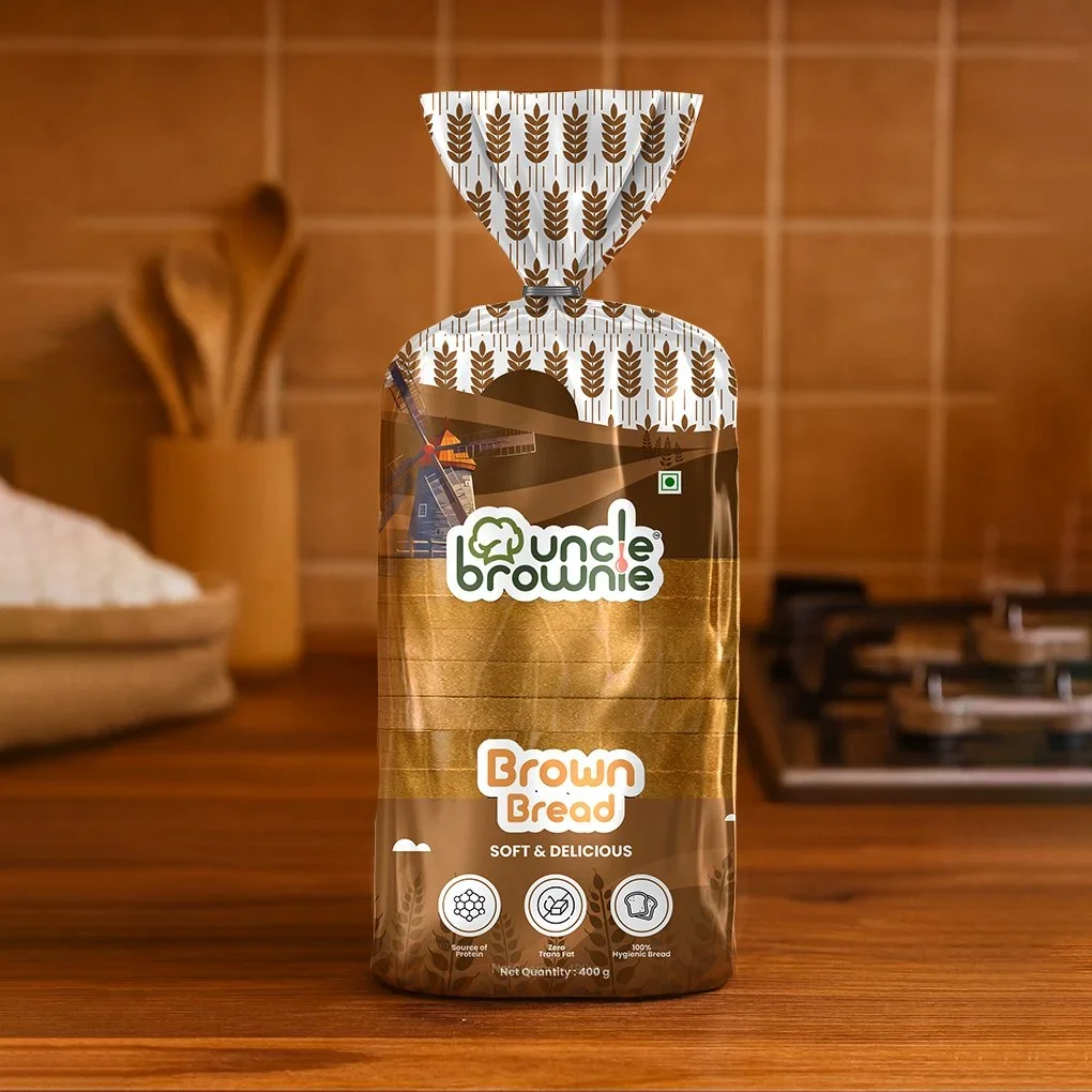
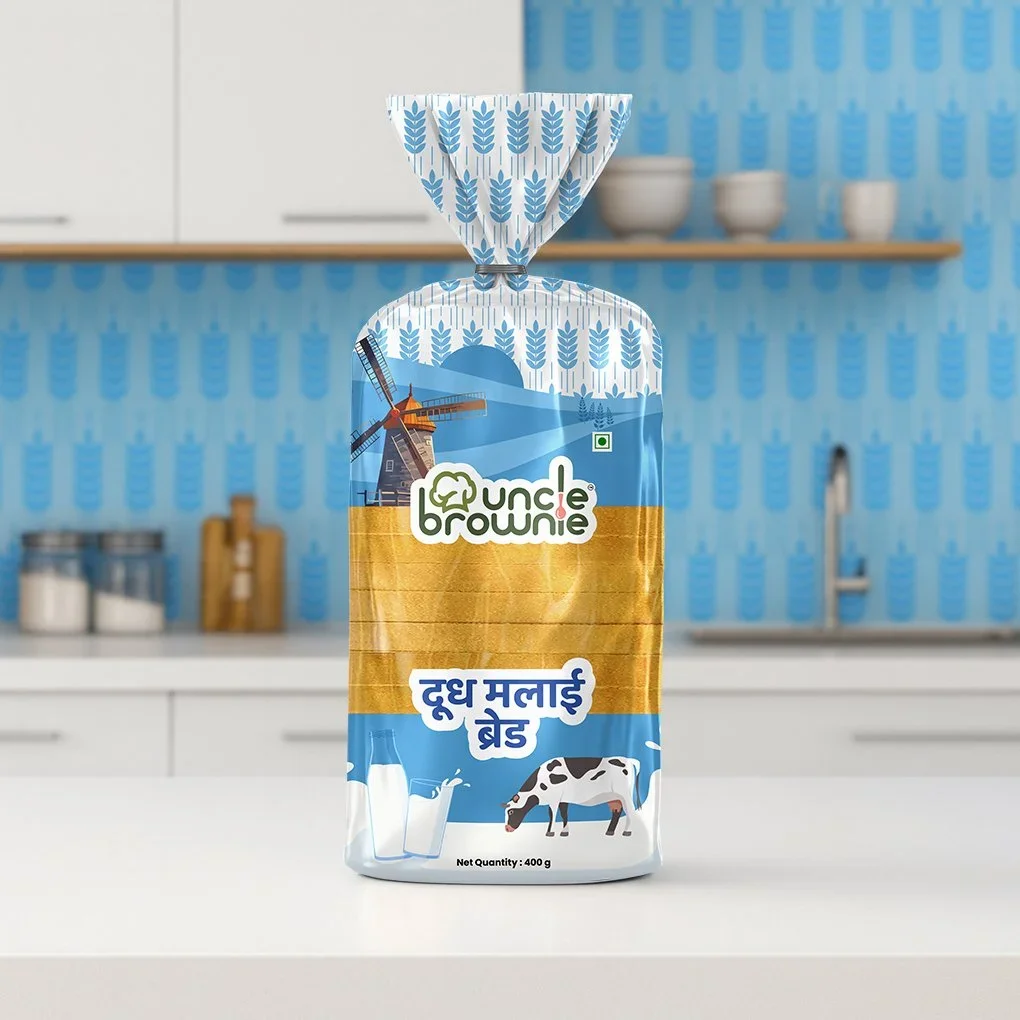
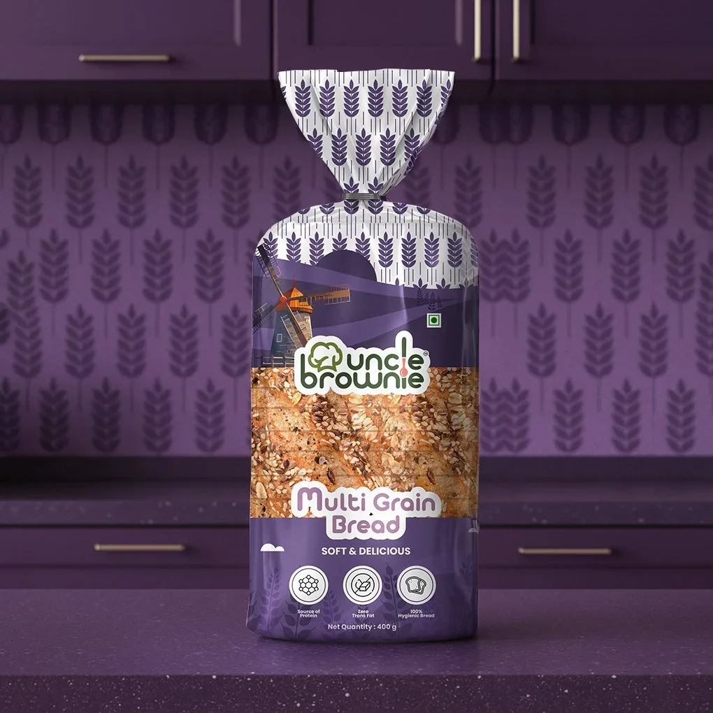
n the Uncle Brownie Breads packaging design project, the Awesome Sauce Creative team took on the challenge of transforming ordinary bread packaging into a strategic brand asset that communicates quality, freshness, and personality. The deliverables included custom wrapper art for various bread formats (loaves and slices), a cohesive visual identity toolkit (logo usage, color palette, typography, layout rules), and a complementary photography style set to visually position the product in everyday kitchen contexts. The design was crafted not just for aesthetic appeal but also for retail efficacy — ensuring clear communication of product attributes, shelf visibility, and an approachable yet modern brand personality that resonates with consumers.
Challenges & Opportunities
The bread category is crowded and often commoditized. To differentiate, Uncle Brownie needed packaging that:
Communicated bread quality (freshness, artisan feel)
Conveyed brand personality (friendly, trustworthy, local yet modern)
Worked across retail shelf and everyday use (loaves, slices, sandwiches)
Aligned with production and cost constraints
Supported shelf visibility, shelf-impact and shelf differentiation
Awesome Sauce Creative identified these must-haves and treated the packaging not just as a wrapper, but as a strategic brand touchpoint.


Outcome
The final packaging design elevated Uncle Brownie’s presence in the highly competitive bread category by shifting the product from a commodity item to a branded experience. The refreshed visual language enhances perceived product value, supports stronger shelf differentiation, and builds consistent brand equity across variants. While specific performance data isn’t public, the strategic packaging is positioned to improve retail impact, consumer recognition, and long-term brand credibility.