

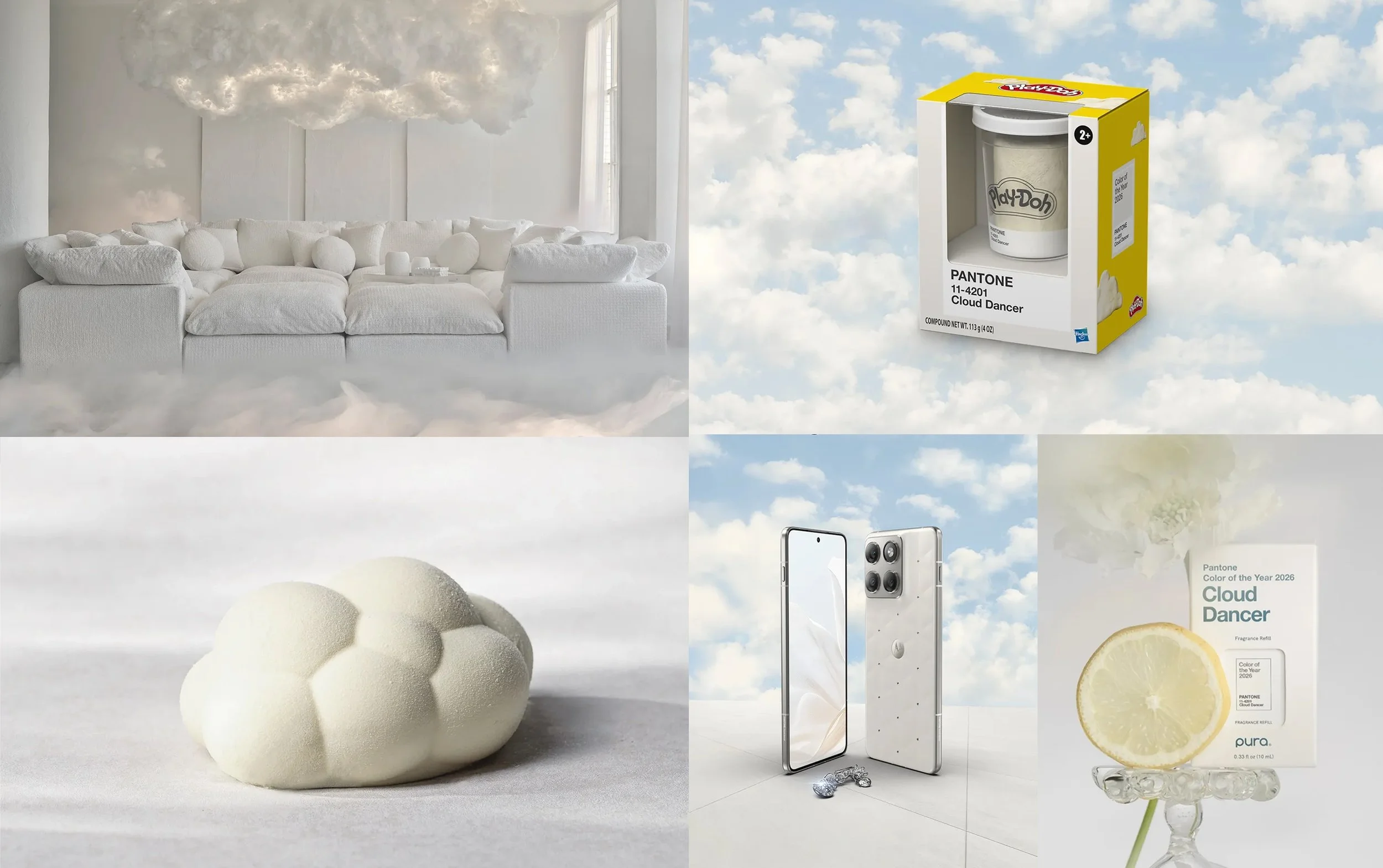
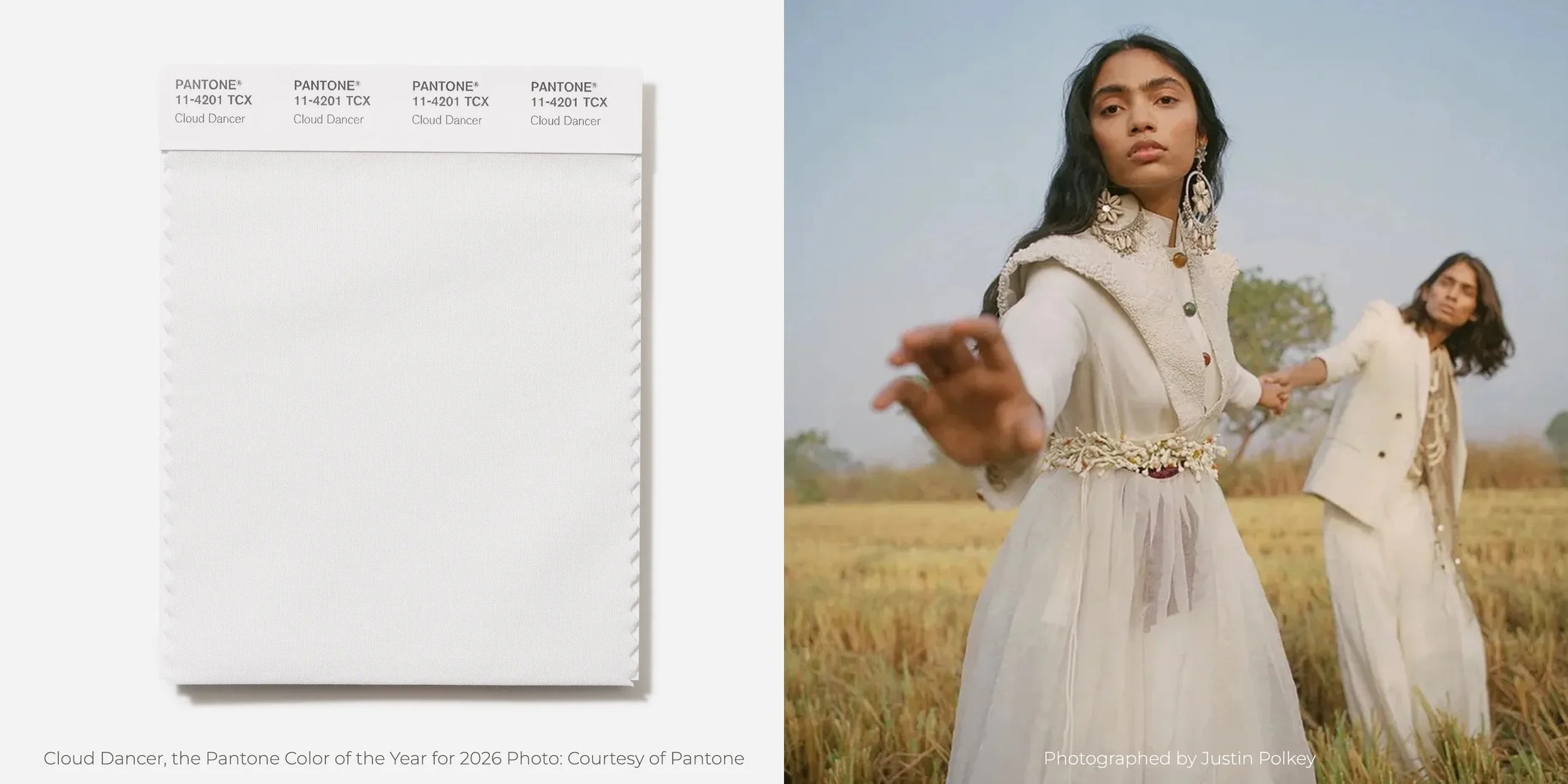
Pantone Color of the Year 2026: Cloud Dancer (PANTONE 11-4201)
Every year, Pantone’s Color of the Year acts as a cultural barometer—reflecting global mood shifts, consumer psychology, and creative direction across industries. For 2026, Pantone has made a bold, almost counter-intuitive choice.
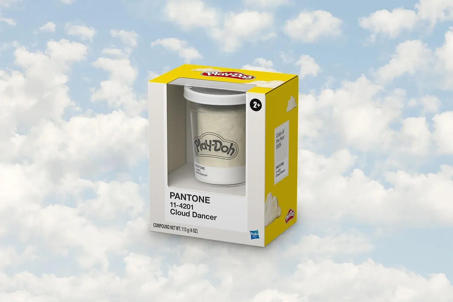
The Pantone Color of the Year 2026 is PANTONE 11-4201 “Cloud Dancer.”
A soft, luminous white that represents calm, clarity, restraint, and intentional simplicity.
This is not “just white.”
This is white with purpose.

What Is Pantone Color of the Year 2026?
Pantone 11-4201 Cloud Dancer is a refined off-white shade with subtle warmth and depth. Unlike stark clinical whites, Cloud Dancer carries a sense of softness—almost atmospheric—making it adaptable across physical and digital environments.
Quick Facts:
Pantone Code: PANTONE 11-4201
Color Name: Cloud Dancer
Category: Soft white / neutral
First-ever white selected as Pantone Color of the Year
Core themes: Calm, balance, renewal, blank canvas, mindful living
Pantone’s choice signals a global pivot away from visual overload toward intentional quietness.
Why Pantone Chose Cloud Dancer for 2026
1. Cultural Fatigue & Visual Overload
We are living in an era of constant stimulation—screens, notifications, bold colors, loud branding, endless content. Cloud Dancer responds to this fatigue by offering visual rest.
2. Rise of Conscious Design
Consumers are prioritizing:
Mental clarity
Slow living
Sustainable choices
Meaningful experiences
Cloud Dancer aligns perfectly with this shift by acting as a neutral grounding force.
3. White as a Creative Reset
Rather than being empty, white represents possibility. Cloud Dancer is positioned as a “starting point” color—allowing brands, designers, and creators to build layered narratives on top of it.
Psychological Meaning of Cloud Dancer (Pantone 2026)
From a behavioral and branding psychology lens, Cloud Dancer communicates:
Trust & honesty – no visual manipulation
Purity & transparency – nothing hidden
Calm authority – confidence without aggression
Premium minimalism – restraint as luxury
This makes it particularly powerful for health, wellness, luxury, architecture, interiors, technology, and food brands.
Pantone 2026 in Branding & Visual Identity
How Brands Can Use Cloud Dancer
Cloud Dancer is not meant to dominate—it is meant to elevate.
Smart Brand Applications:
Logo backgrounds for premium positioning
Packaging that emphasizes purity & quality
Website UI for reduced cognitive load
Editorial layouts with generous white space
Strategic Advantage
Brands using Cloud Dancer signal:
Maturity
Long-term thinking
Confidence in substance over spectacle
In crowded markets, silence often speaks louder than noise.
Pantone Color of the Year 2026 in Interior Design
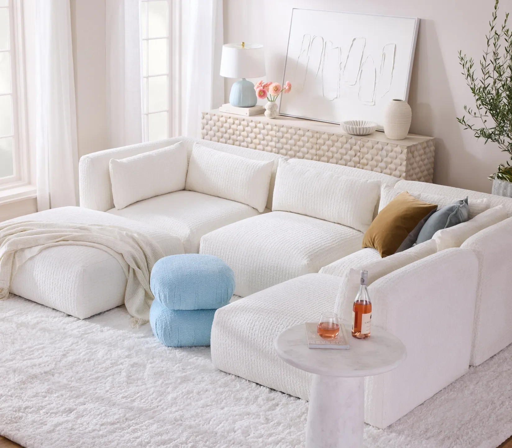
Cloud Dancer is exceptionally powerful in interiors because it interacts beautifully with light, texture, and materiality.
Interior Use Cases:
Luxury residential spaces
Hospitality & wellness environments
Modern office spaces
Galleries and experiential retail
Material Pairings:
Natural marble
Light oak & ash wood
Linen, cotton, raw stone
Brushed metal & soft brass
Rather than feeling empty, Cloud Dancer allows materials to breathe.
Fashion & Textile Impact of Pantone 2026
In fashion, Cloud Dancer represents:
Elevated basics
Timeless silhouettes
Sustainable wardrobes
Designers are using it for:
Monochrome looks
Layered textures
Bridal & occasion wear
High-end resort collections
White in 2026 is not about trends—it’s about longevity.
Digital Design & UX Implications
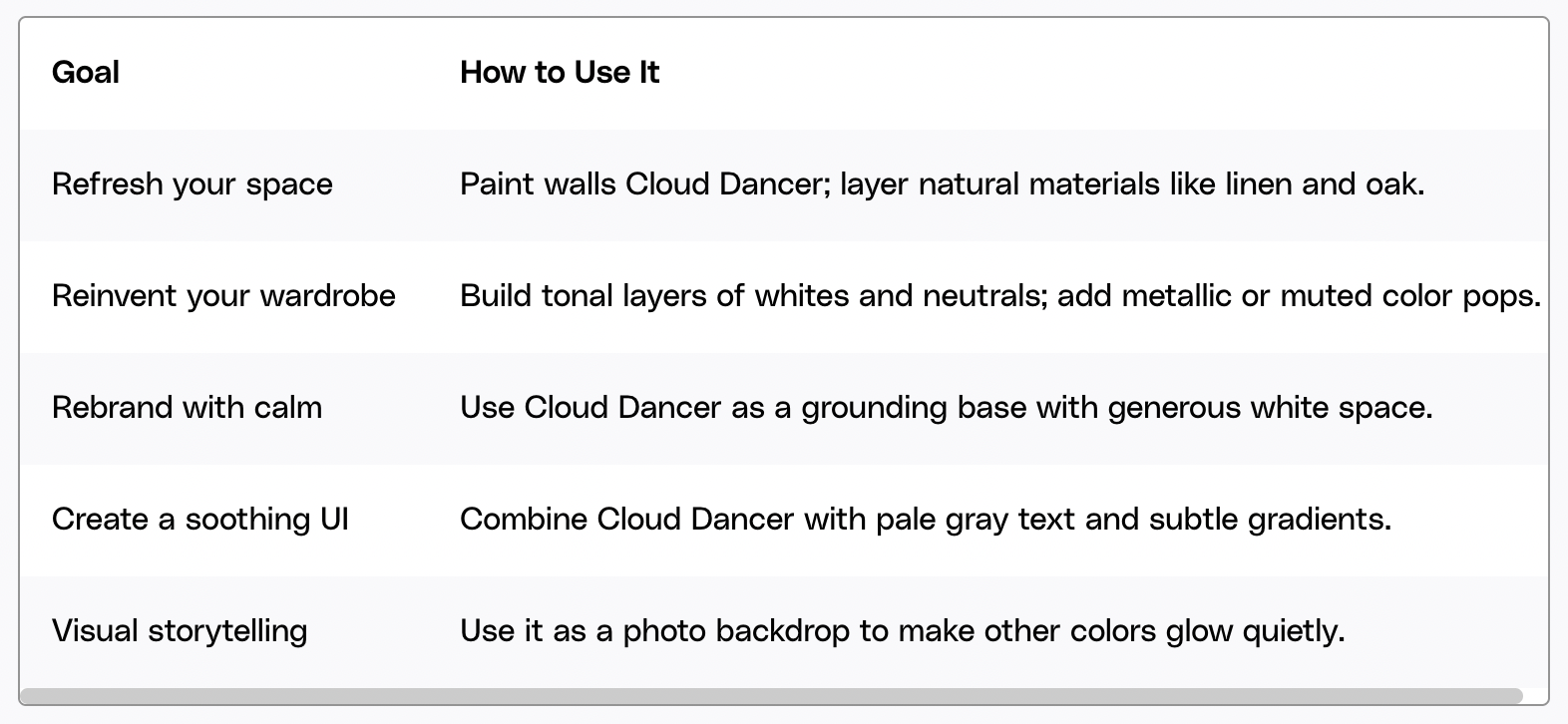
Envato
In digital environments, Cloud Dancer improves:
Readability
Focus
User trust
Accessibility
Expect to see:
Minimal UI systems
Content-first websites
Reduced color noise
Typography-led layouts
For SaaS, fintech, and wellness platforms, Cloud Dancer reinforces credibility and calm decision-making.
How to Pair Cloud Dancer: Color Combinations That Work
Cloud Dancer performs best when paired intentionally.
High-Impact Pairings:
Cloud Dancer + Charcoal Grey → Modern authority
Cloud Dancer + Transformative Teal → Calm innovation
Cloud Dancer + Warm Sand → Organic luxury
Cloud Dancer + Deep Black → Editorial elegance
Cloud Dancer + Muted Pastels → Soft contemporary
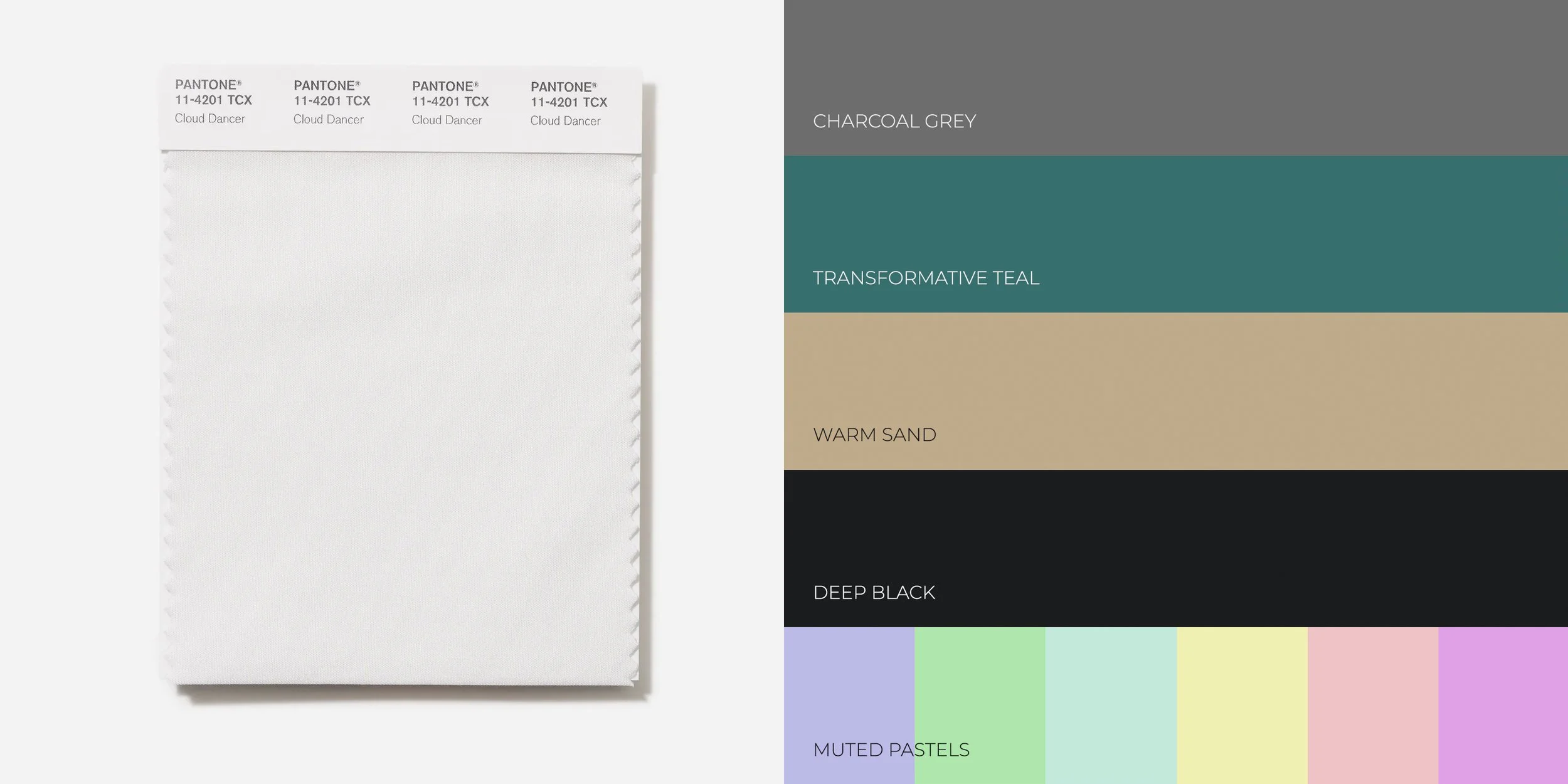
Avoid pairing it with overly saturated neons—it breaks the philosophy.
Is Pantone 2026 “Too Safe”? The Strategic Answer
Critics argue that choosing white is “boring.”
That argument misses the point.
In 2026, restraint is radical.
Cloud Dancer is not about playing safe—it’s about playing long.
Brands and designers who understand this will use Cloud Dancer not as a color, but as a framework for clarity.