

5 Logo Design Trends Reshaping Brands in 2026
How the world's leading brands are creating identities that feel human, alive, and unforgettable.
Something fundamental is shifting in the world of brand identity. After a decade of minimalist conformity—where every logo looked like a geometric sans-serif wordmark in a perfect circle—2026 marks a dramatic departure.
Brands are no longer asking "What's safe?" They're asking "What makes us unmistakably us?"
Based on comprehensive analysis from leading forecasting companies including WGSN, Pantone, Coloro, LogoLounge, and VistaPrint, we've identified five transformative trends that aren't just changing how logos look—they're redefining what logos do, how they behave, and most importantly, how they make people feel.
1. Dynamic & Adaptive Identity Systems
The static logo is dead. Welcome to the age of living brands.
The Data: Over 50% of American and European companies are implementing dynamic logos, making this the dominant trend of 2026.
What It Means
Your logo no longer lives in one place or looks one way. It adapts based on context—shifting colors for dark mode, simplifying for tiny app icons, animating for social media, or even changing based on time of day or user preferences.
Think of it like this: instead of designing a single frozen image, you're creating a brand DNA that expresses itself differently depending on where it lives.
The Evolution Story
1990s: MTV
The first major brand to embrace a constantly morphing logo, proving identity could be fluid.
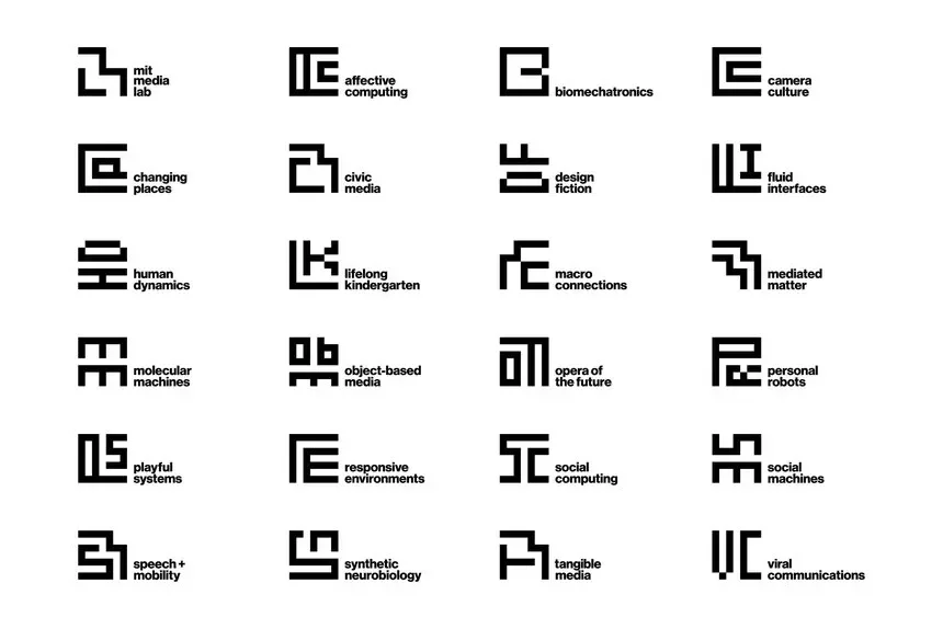
2010: MIT Media Lab
Created 40,000 algorithmic variations from three colored squares—same DNA, infinite expressions.
2016: Mobile Overtakes Desktop
Suddenly brands needed responsive identities that worked on 3-inch screens and 30-foot billboards.
2020s: Context-Aware Era
Spotify, Netflix, and Google demonstrate logos that respond to user behavior, platform, and even mood.
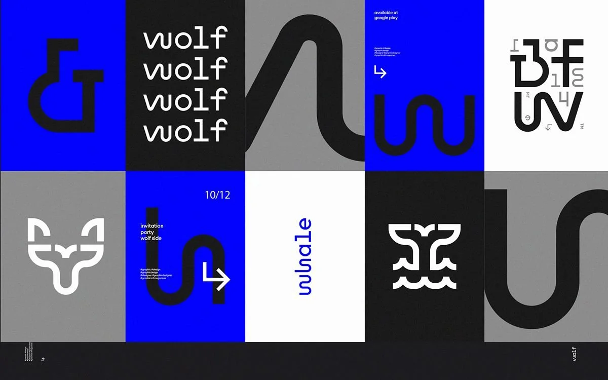
Eg. Wolf & Whale Digital Global Branding
Why It Works: The Psychology
Recognition Through DNA, Not Replication: Humans don't memorize logos pixel-by-pixel. We remember the essence—color combinations, shape language, feeling. Dynamic systems satisfy our brain's need for both consistency (the pattern) and novelty (the variation), preventing "banner blindness."
Key Insight: When a logo adapts to your context—switching to dark mode automatically, or celebrating a cultural moment—your brain unconsciously registers "this brand sees me." That creates connection.
2026 Impact on Design
New deliverables: Designers now create identity systems with rulebooks, motion guidelines, and algorithms—not just static files
Required skills: Animation principles, CSS/SVG manipulation, systems thinking become essential
Platform-native thinking: Every brand must work across 10+ contexts: app icon, AR overlay, social avatar, dark mode, print, motion, and more
2. Neo-Minimalism with Warmth
Minimalism isn't dead—it just got a soul.
The Problem With Old Minimalism
For the past decade, minimalism meant sterile. Clean became cold. Simple became soulless. By 2020, every brand looked identical: geometric sans-serif wordmarks in perfect circles. The critique was harsh but accurate: "the blanding of brands."
The 2026 Solution
Neo-minimalism keeps the clarity but adds selective warmth. Think soft curves instead of perfect circles. Subtle textures that suggest paper or fabric. Custom letterforms with slight irregularities that feel hand-touched rather than machine-generated.
The formula: Clarity + Selective Detail + Warmth = Owned, Not Generic
From Bauhaus to Human Touch
1919-1933: Bauhaus
"Form follows function" and "less is more" become design religion.
1957: Helvetica
The "neutral" typeface that dominated corporate design for 50+ years.
2013: Flat Design Peak
iOS 7 eliminates all texture, shadow, and dimension. The decade of stark minimalism begins.
2015-2020: The Backlash
Users crave personality. Every brand looks the same. The search for "warmth" begins.
2026: Warmth Wins
Minimalism remains foundational, but must now feel human, approachable, owned.
The Behavioral Science
The Goldilocks Principle:
Too complex: Overwhelms, reduces memorability
Too minimal: Feels cold, generic, forgettable
Just right: Simple enough to process instantly + distinctive enough to feel human
Key Insight: In the age of AI-generated perfection, slight imperfections signal human craftsmanship. Your brain trusts warmth more than it trusts perfection.
How Designers Execute This
Micro-textures: Subtle grain or paper texture (5-15% opacity)
Optical adjustments: Hand-tuned curves instead of perfect mathematical circles
Warm color theory: Beige replaces stark white; warm grays instead of cool tones
Custom type: Bespoke letterforms with humanist touches and gentle irregularities
3. "Beautiful Mistakes" & Controlled Imperfection
The most distinctive brands in 2026 have one thing in common: an intentional "flaw" that becomes their signature.
What This Trend Looks Like
A letter that's slightly tilted when everything else is aligned. A quirky gap in an otherwise geometric shape. Gradients that are intentionally "dirty." Type that bounces off the baseline. Asymmetry where you'd expect perfect balance.
This isn't sloppiness—it's strategic distinctiveness. One carefully chosen imperfection that makes people stop and think: "Only this brand would do that."
The Ancient Philosophy Behind It
Wabi-Sabi (侘寂): A 500-year-old Japanese aesthetic philosophy that finds beauty in imperfection, impermanence, and incompleteness. In the 15th century, tea master Sen no Rikyū replaced gold tea services with simple cracked clay—celebrating the marks of use and time.
Western Design's Journey: It took until 1994 for Leonard Koren's book to introduce wabi-sabi to Western designers. By 2020s, it became a rebellion against digital perfection.
Why Our Brains Love It
The Authenticity Paradox:
Perfection = Mass Production: Flawless logos feel machine-made, corporate, distant
Imperfection = Craft: Irregular elements communicate human involvement and care
Memory Formation: The brain remembers anomalies. Distinctive "flaws" create stronger brand recall
Key Insight: As AI produces increasingly "perfect" work, controlled imperfection becomes proof of human authorship. In 2026, perfect is suspicious. Imperfect is trustworthy.
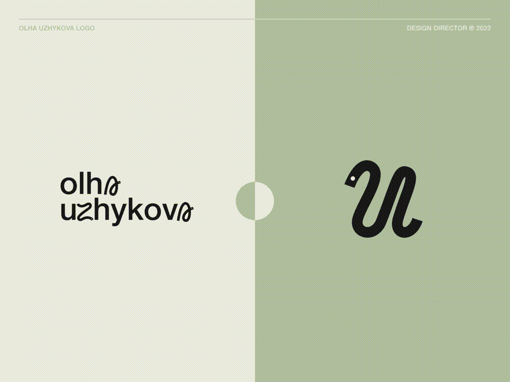
The "Little Blip" Technique
This trend's signature move: use ONE intentional imperfection as your brand's calling card. Not chaos everywhere—one thoughtful break from expectation that becomes unmistakably yours.
Perfect For
Creative industries and design studios
Lifestyle and wellness brands
Startups wanting personality over polish
Any brand competing in oversaturated markets
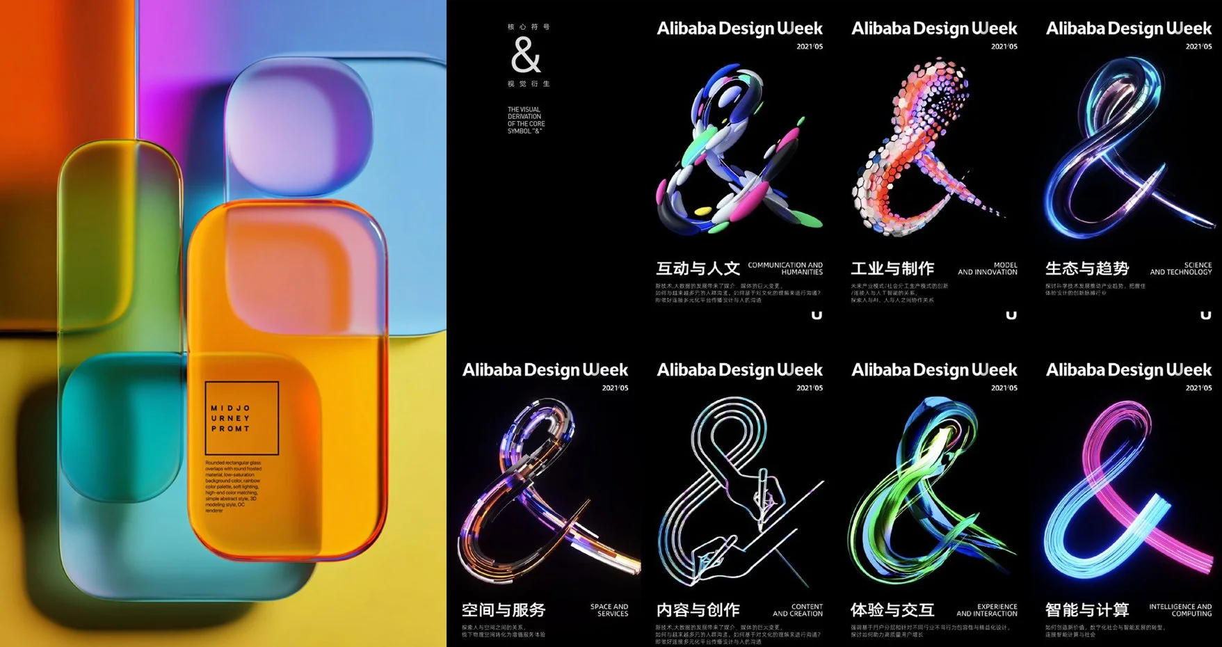
4. 3D Gradients & Holographic Effects
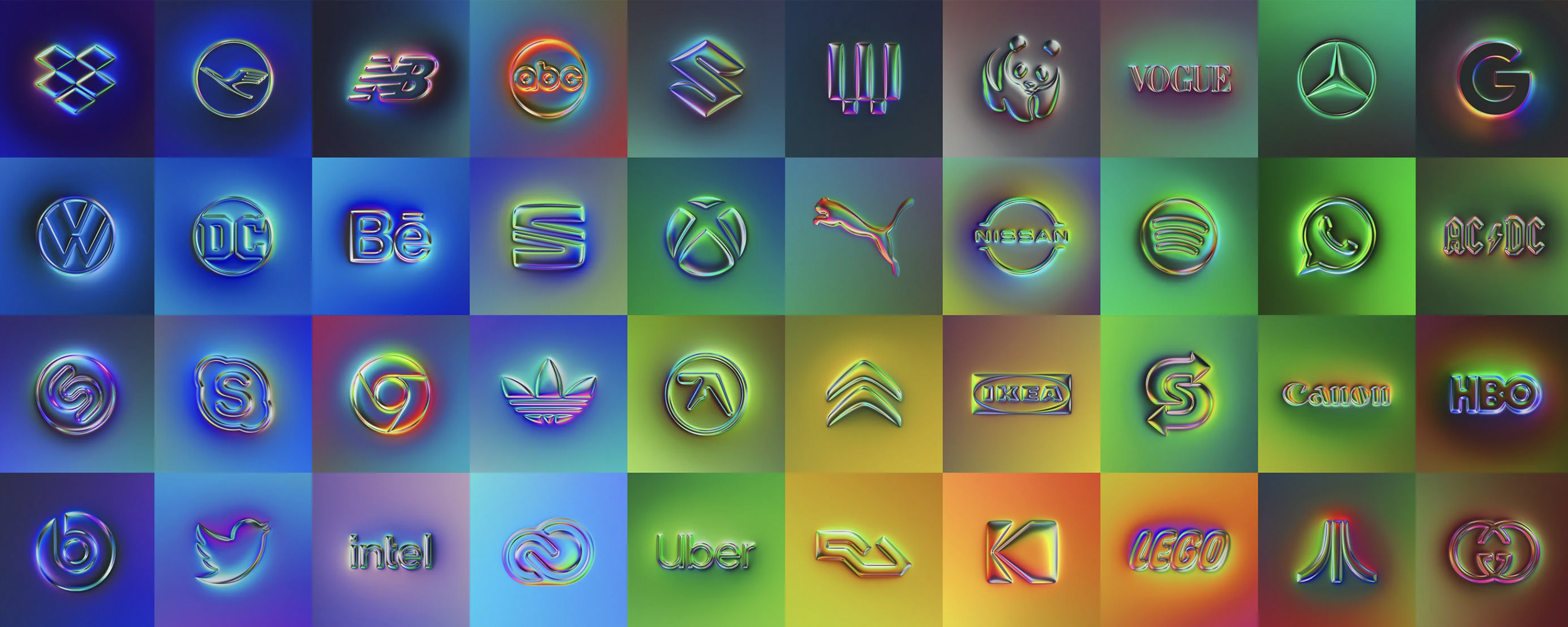
The flat design era is officially over. Depth, shimmer, and aurora-like color blending are back—but sophisticated.
What Changed
Remember the gradient backlash of 2013-2018? When flat design killed all dimension, shadows, and color transitions? That era ended dramatically when Instagram, Spotify, and Stripe proved gradients could be modern, premium, and beautiful.
But 2026's gradients aren't your early-2000s glossy buttons. These are:
Mesh gradients: Multi-point color blending that creates dreamlike, organic transitions
Holographic effects: Iridescent, metallic, glass-like surfaces that shift with light
Textured gradients: Organic grain overlays that add analog warmth to digital color
Particularly Popular With Gen Z: This is the native visual language of a generation raised on Instagram Stories, Snapchat filters, and digital art. Gradients feel natural, expressive, and premium.
The Journey Back to Depth
1980s: Holography Goes Mainstream
Credit cards and passports establish holographic = futuristic + secure.
2000s: Gradient Peak
Web 2.0 embraces glossy buttons and reflections. Apple's Aqua interface shines.
2013: The Great Flattening
iOS 7 eliminates all gradients. The industry follows. Flat design reigns.
2016: Instagram's Return
Instagram's gradient rebrand proves sophisticated gradients can work. The gates reopen.
2020s: Aurora Aesthetics
Grainy, textured, holographic gradients explode. Y2K nostalgia meets modern execution.
Why It Captivates Us
Visual Attention: Eye-tracking studies show gradients hold attention 40-60% longer than solid colors. Multiple colors in one element = more neural activation.
Emotional Associations:
Holographic = Futuristic: Links to sci-fi, innovation, next-generation thinking
Aurora colors = Natural Beauty: Despite being digital, these feel organic (a paradox that works)
Metallic = Premium: Reflective surfaces signal value (gold, silver, chrome)
Key Insight: Products with holographic/gradient packaging have 23% higher pick-up rates on shelves. Social posts with gradient backgrounds get 18% more engagement. For brands targeting younger audiences, this isn't optional—it's expected.
Strategic Applications
Beauty & Fashion: Premium feel, Instagrammable appeal
Tech & Fintech: Modern, innovative, cutting-edge signal
Gen Z Marketing: Native visual language for digital natives
Packaging: Stands out through color-shifting, light-reactive effects
5. Artistic & Expressive Typography
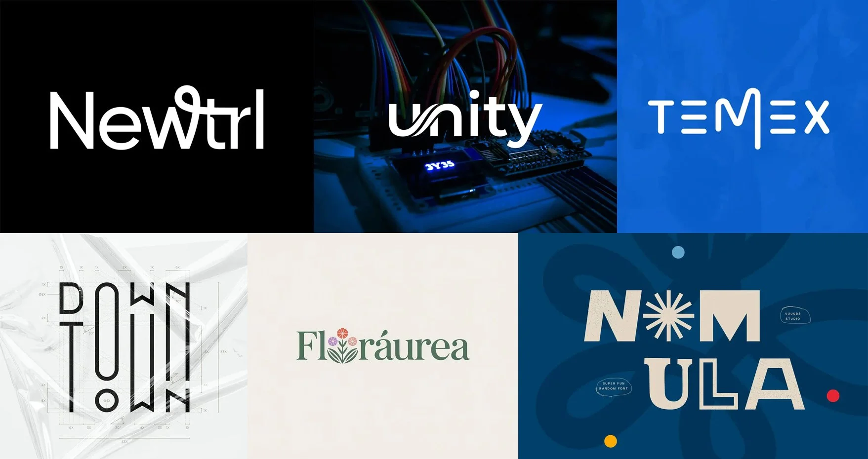
The icon is optional. Typography is now the hero.
The Shift: 29% of new logos now use stylistic, creative fonts as the primary brand element. Typography-led identities are dominating 2026.
What This Means
Brands are choosing bold, distinctive wordmarks over icons. Custom letterforms with exaggerated features—elongated stems, playful ligatures, dramatic weight contrast. Typography that functions as both text and illustration.
The message: "Our name, expressed in a typeface only we would choose, is our logo."
From Gutenberg to Variable Fonts
1440: Movable Type
Gutenberg creates mechanical reproduction. Typography born from practicality.
1957: Helvetica Era
The "neutral" corporate standard dominates for 50+ years.
1990s: David Carson
Ray Gun magazine breaks every rule. Expressive typography movement born.
2016: Variable Fonts
OpenType introduces fonts with infinite weight/width variations in single files.
2020s: Typography as Hero
Major brands (YouTube, Spotify, eBay) choose wordmarks. Custom typefaces become standard.
The Psychology of Type
Type = Voice: Fonts create auditory associations in the brain. Within 50 milliseconds, your typography influences brand perception:
Rounded sans-serifs: Friendly, approachable, affordable
Thin serifs: Luxury, expensive, exclusive
Bold geometric: Tech-forward, innovative, strong
Hand-lettered: Artisanal, authentic, local
Key Insight: Restaurant menus using script fonts see 18% more orders of premium items. E-commerce sites using sans-serifs convert better for tech products; serifs convert better for luxury goods. Typography directly impacts purchasing behavior.
What Designers Are Doing
Exaggerated features: Elongated stems, playful ligatures, dramatic weight shifts
Unexpected combinations: Mixing serif + script, geometric + organic
Text as image: Letters shaped, colored, and textured like illustrations
Motion typography: Letters that animate, respond to interaction, transform
2026 Design World Impact
Custom brand typefaces are now $50K-$500K projects. Type foundries are booming. Design schools emphasize typography as a specialization. For established brands, off-the-shelf fonts are seen as lazy—custom is expected.
The Unifying Thread
These five trends aren't isolated stylistic choices. They're responses to the same cultural moment: authenticity hunger in an AI-saturated, algorithmically homogeneous world.
Successful brands in 2026 feel human, alive, personal, and distinctive. They adapt to context, express warmth through restraint, embrace strategic imperfection, captivate through color and depth, and speak through typography that sounds unmistakably like them.
The bottom line: In a world full of slick, similar logos, the brands winning attention feel human. And that's not an accident—it's intentional design meeting genuine human need.