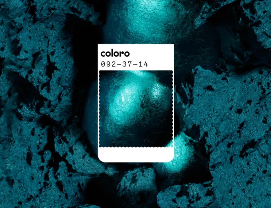
Transformative Teal in Branding
1. Why this matters
When WGSN and Coloro announced “Transformative Teal” (Coloro code 092-37-14) as the Colour of the Year 2026, they weren’t just picking a trending shade. They were signalling a cultural shift—brands must embody transformation, regeneration and trust simultaneously. WGSN
For a branding agency like Awesome Sauce Creative, this is a strategic moment: the colour is a potent visual shorthand for positioning a brand as future-proof, grounded and emotionally intelligent.
2. What does Transformative Teal mean for brands?
Duality: It fuses the stability and trust of deep blue with the growth, vitality and renewal associated with green. This gives brands a vocabulary of “solid yet evolving.” Font & Swatch
Regeneration & sustainability: The colour is explicitly positioned around ecological consciousness and design that respects nature and tech simultaneously. Jimei New Material
Digital & real world bridging: Teal works well both on screen (apps, UI) and in physical touch-points (interiors, packaging). That crossover is rare and valuable.
3. When to use it in branding
a) Brand identity / Logo
Choose Transformative Teal when your brand wants to say:
“We’re rooted, but we’re evolving”
“We combine legacy + innovation”
It’s especially effective for tech-brands, wellness brands, sustainable product lines.
Tip: Use a bold teal plus a neutral support colour (e.g., stone grey or chalk white) so that the teal holds meaning rather than just being decorative.
b) Visual system / Colour palette
Primary usage: The pure teal tone becomes a hero colour.
Secondary palette: Pair with metallic copper (to give warmth/urgency), muted neutrals (for calm) and maybe a contrasting accent (digital lavender or warm peach) to support the brand narrative.
Consider texture and finish: a matte finish feels grounded and material; a high-gloss or digital gradient version leans more futuristic.
c) Touch-points: packaging, interiors, digital
Packaging: Teal gives shelf impact, but also suggests “premium yet trustworthy.”
Interior/retail spaces: Teal walls or accents feel calm but rich; combine with natural materials to highlight sustainable credentials.
Digital/UI: Teal works as a primary accent or cast colour for call-to-actions, brand-bars, iconography. Because it sits between blue and green it avoids feeling cold-tech or purely eco-green—it strikes a hybrid feel.
4. Pitfalls & how to avoid them
Overuse = fatigue: Because it’s forecast as a big colour, turning everything teal will dilute its impact. Use it strategically—hero colour + supporting neutral-driven palette.
Mismatch of tone: If your brand is loud, hyper-vibrant, flamboyant, teal may feel too restrained. Conversely, if your brand is ultra-minimal-black-&-white luxury, teal might seem uncharacteristic unless deliberately used as accent.
Wrong pairing: Teal needs careful companions. Pairing with overly bright neons or clashing hues can undermine the “calm innovation” message.
Ignoring finish/medium: Teal in print vs digital vs textile will appear differently. Always test conversions and ensure consistent brand perception.
5. Grounded application
A wellness-tech startup: Use Transformative Teal as the primary brand colour, paired with warm grey and copper accents. UI buttons in teal. Logo icon in teal. Packaging in off-white with teal highlights. Message: “tech that cares.”
A redesign of an interior-design brand: Feature teal accent walls, teal upholstery cushions, integrated into a neutral natural-material palette (wood, stone). Branding collateral uses teal for headlines, stone grey for body text.
A packaging refresh for a sustainable product line: Teal as the hero colour on the box, supported by recycled kraft brown and chalk white graphics. It signals “eco premium” effectively.
6. Why it will resonate in 2026
Cultural climate: There’s rising demand for balance (between tech and nature, fast and slow, global and local). Transformative Teal embodies that middle path. hwafune.com
Brand differentiation: As more brands claim sustainability, using a strong symbolic colour like teal—when backed with real strategy—can help you stand out meaningfully.
Flexibility: Because teal bridges two major colour “families,” it offers adaptability. Works across sectors (not just lifestyle or tech) and across mediums.


