

Bharat Ayurvedic Aushdhalay - Re-Branding & Identity Design Project
Client: Bharat Ayurvedic Aushdhalaya
Project: Brand Rebranding & Visual Identity
Creative Agency: Awesome Sauce Creative
Category: Ayurveda, Healthcare & Wellness Branding
Bharat Ayurvedic Aushdhalaya approached Awesome Sauce Creative with the objective of transforming its traditional Ayurvedic identity into a more contemporary, distinctive and scalable wellness brand.
The challenge was not to move away from Ayurveda, but to reinterpret it for a modern audience. The brand needed to retain the trust, authenticity and heritage associated with traditional Ayurvedic knowledge while building a visual identity that could feel relevant within today’s evolving healthcare and wellness landscape.
Our rebranding approach therefore focused on creating a brand system where ancient Ayurvedic wisdom meets contemporary wellness design.
The Rebranding Challenge
Ayurveda has a strong and instantly recognisable visual language. Herbal ingredients, leaves, earthy colours, traditional vessels and classical Indian motifs have become synonymous with the category. While these cues build familiarity, they can also make brands within the Ayurvedic space look increasingly similar.
For Bharat Ayurvedic Aushdhalaya, the objective was to retain these important cultural and category associations without creating another conventional herbal or medicinal-looking identity.
The new brand needed to communicate four essential ideas: natural healing, care, authenticity and modern credibility.
At the same time, the identity had to work beyond a single logo. It needed to create a flexible visual ecosystem that could eventually extend across packaging, digital communication, retail environments, marketing collateral and other consumer touchpoints.
Our Brand Strategy
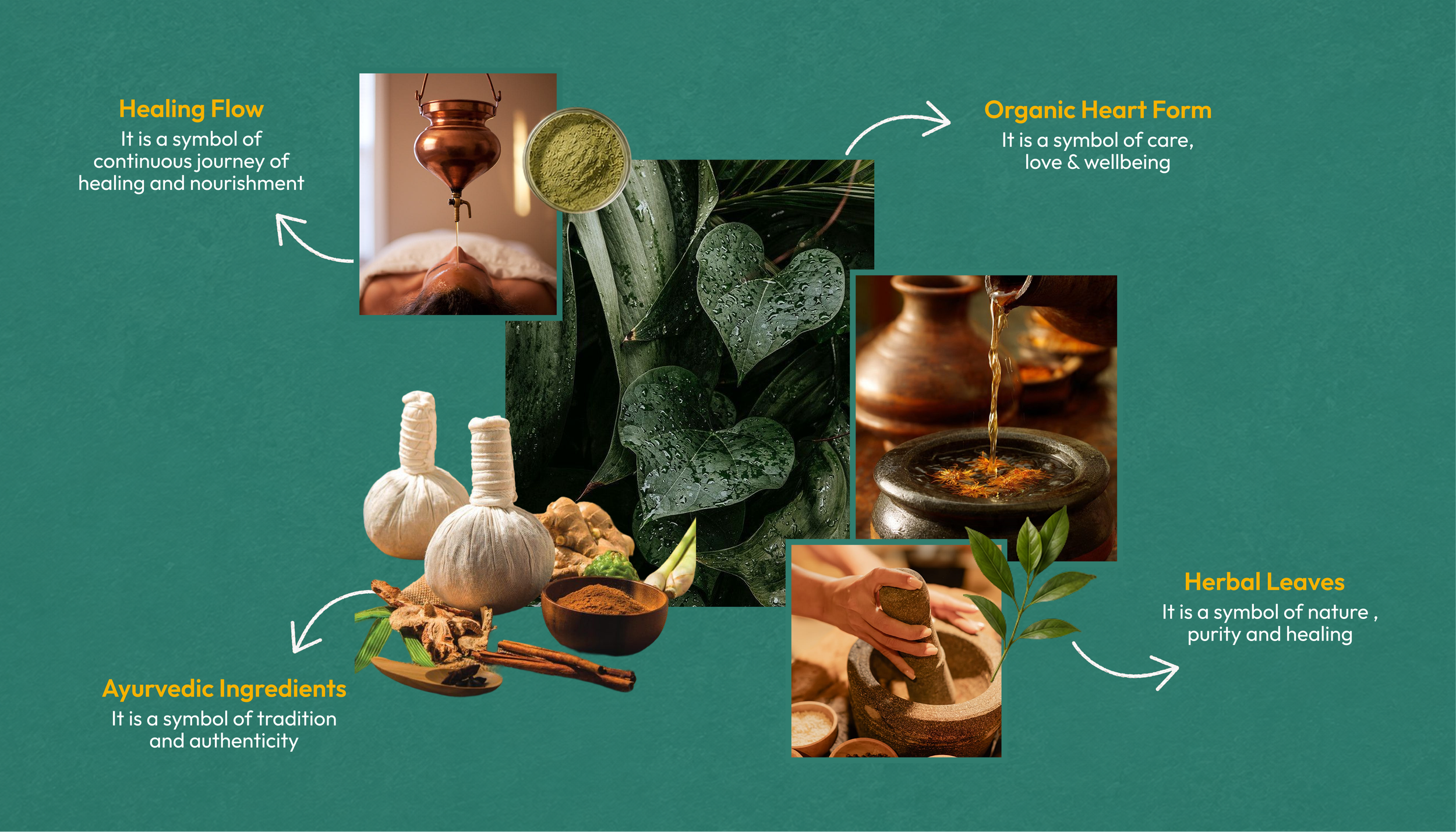
We built the new identity around the idea that Ayurveda is not simply a system for treating illness. It represents a more continuous relationship between nature, healing, nourishment and wellbeing.
This thinking helped us develop a visual language based on four core themes: the continuous flow of healing, the organic shape of the heart, Ayurvedic ingredients and herbal leaves.
The result is a brand identity that acknowledges the heritage of Ayurveda while presenting it through a cleaner, more approachable and contemporary visual system.
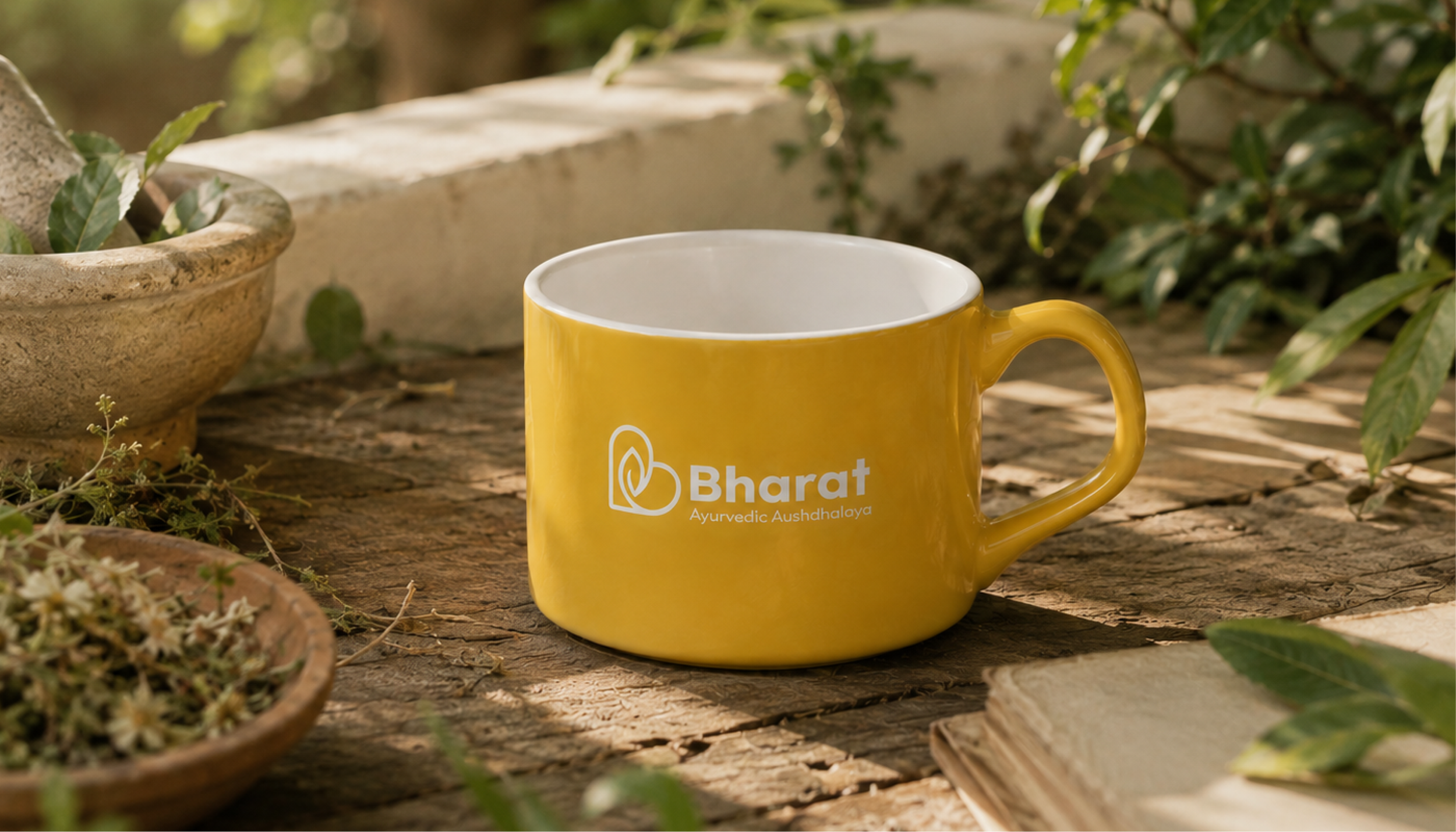
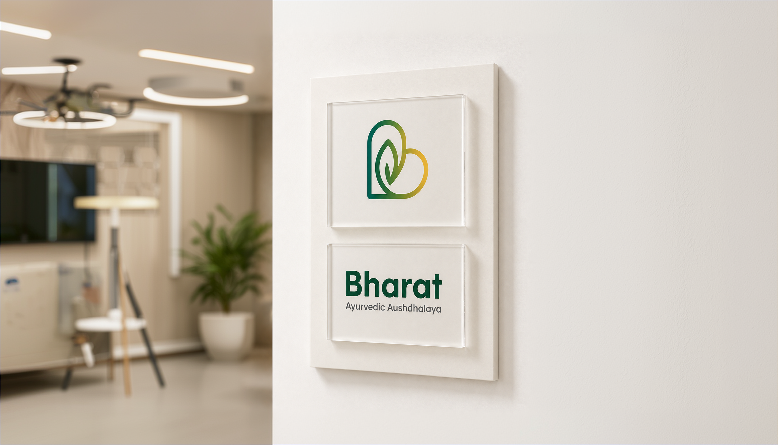
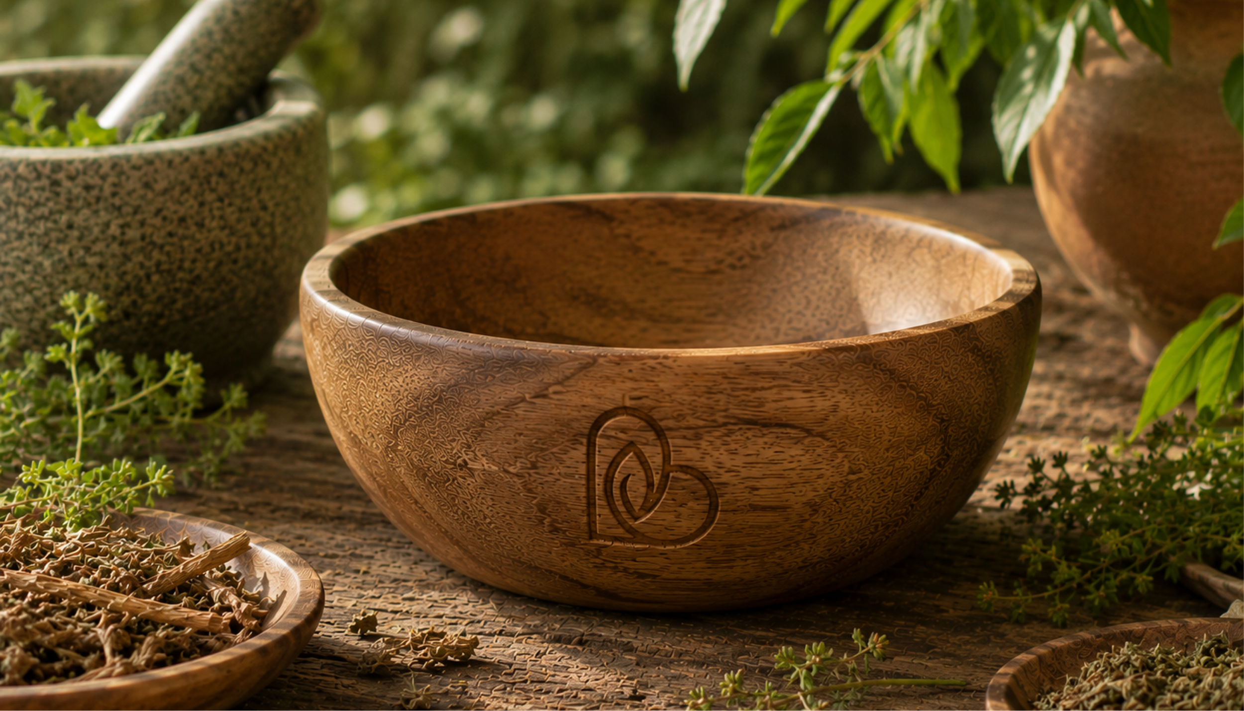
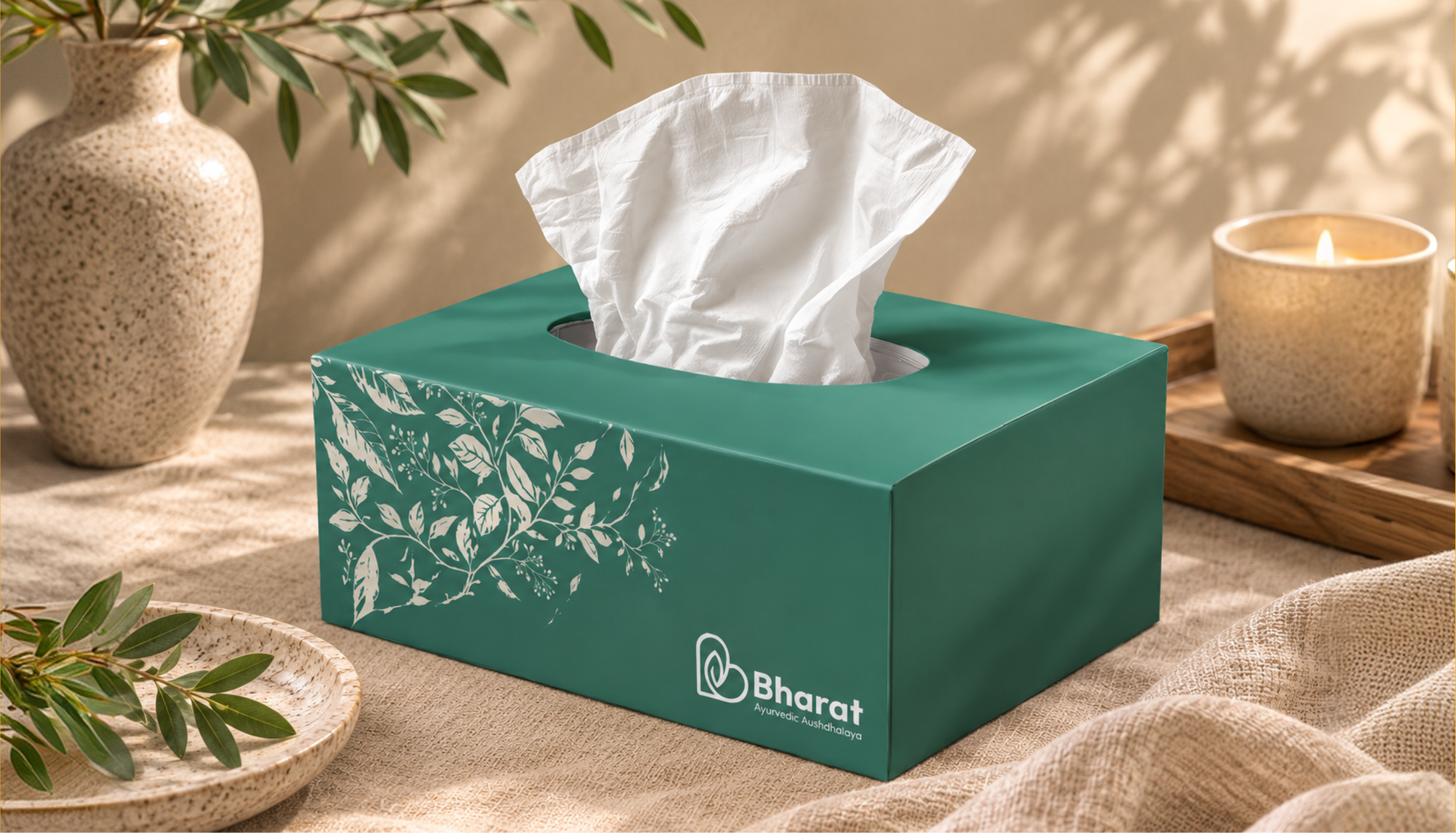
Logo Design: Heart + Leaf + Bharat
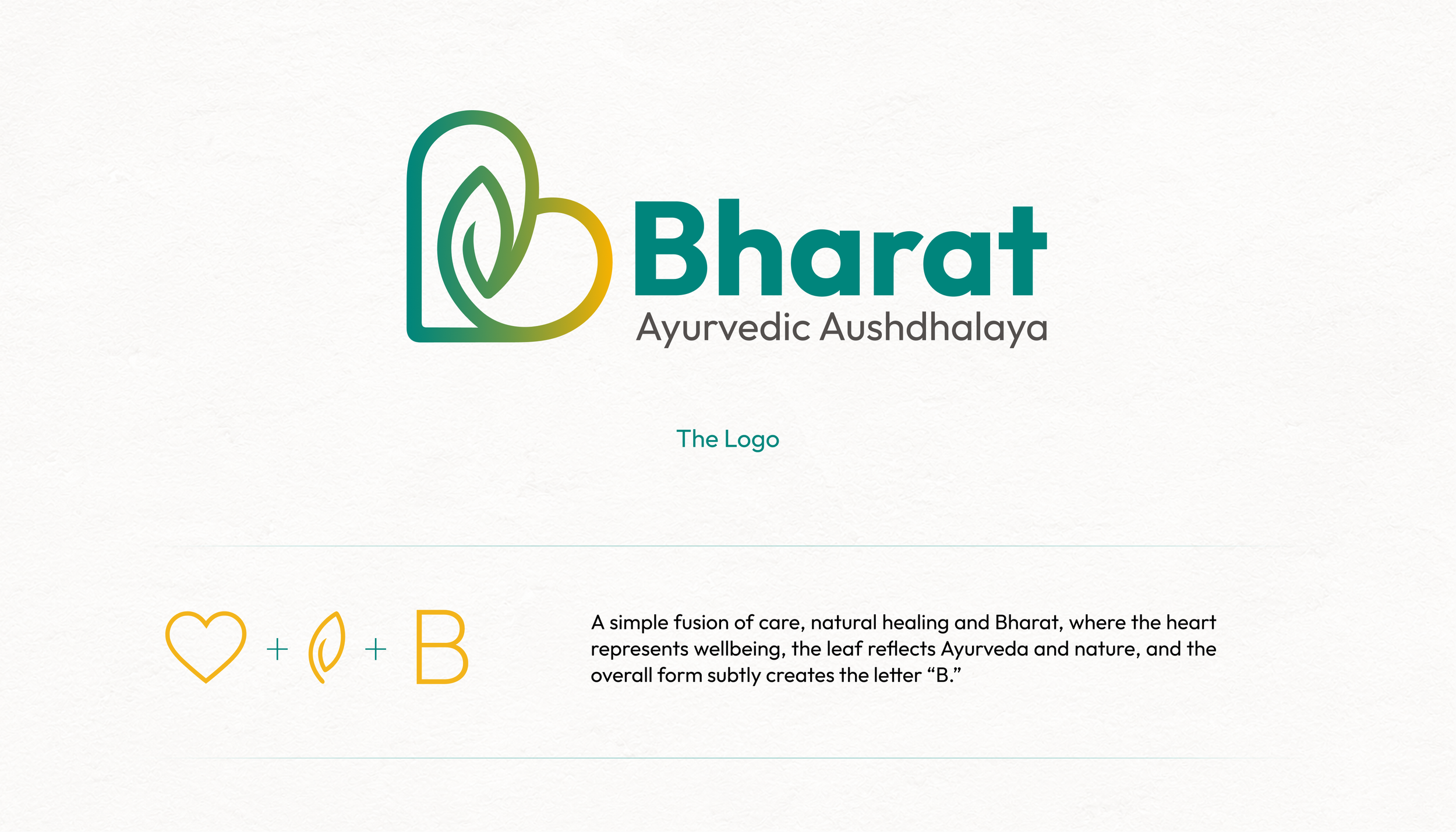
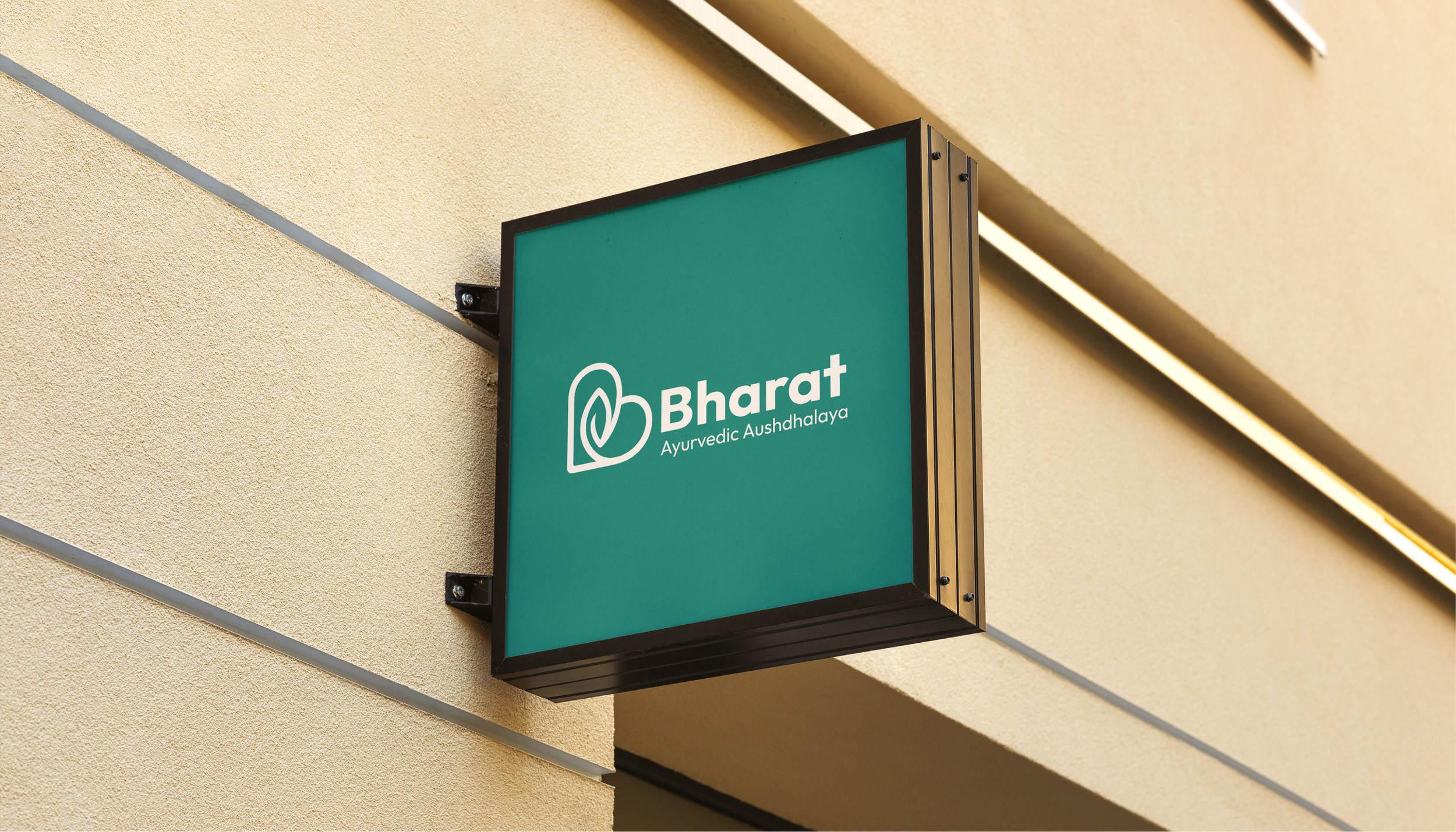
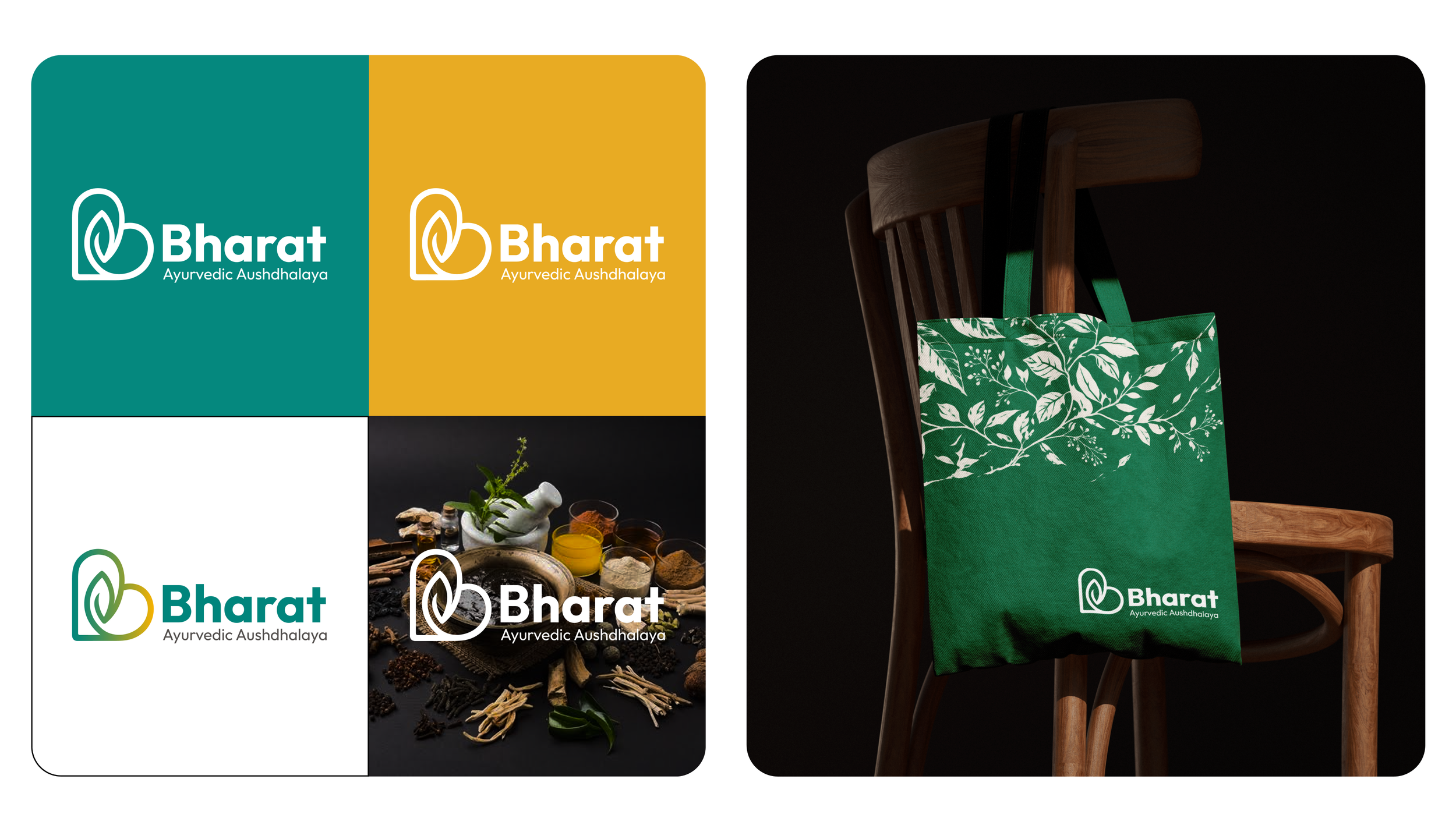
At the centre of the Bharat Ayurvedic Aushdhalaya rebranding is a custom logo symbol created by bringing together three meaningful elements: a heart, a leaf and the letter “B”.
The heart represents care, compassion and wellbeing — positioning the brand around the person rather than only around the treatment.
The leaf represents nature, plant-based healing and Ayurveda.
The overall construction subtly forms the letter “B”, creating a distinctive connection with the Bharat name.
The flowing lines within the symbol also communicate continuity and movement, representing healing as an ongoing journey rather than a one-time intervention.
Instead of using Ayurvedic symbolism merely as decoration, the new logo converts the philosophy of the brand into a simple and recognisable visual mark.
A Contemporary Ayurvedic Colour Palette
Colour played a major role in moving the identity beyond the predictable visual conventions commonly associated with Ayurvedic brands.
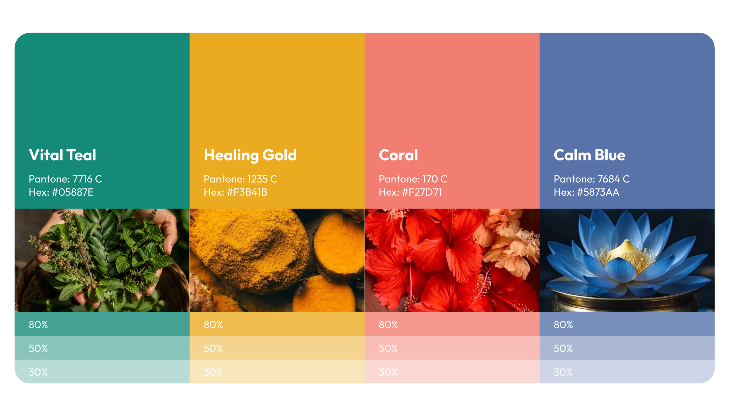
We developed a broader wellness-inspired palette consisting of:
Vital Teal — Pantone 7716 C / #05887E: representing nature, vitality, trust and contemporary wellness.
Healing Gold — Pantone 1235 C / #F3B41B: bringing warmth, optimism and a connection with India’s cultural richness.
Coral — Pantone 170 C / #F27D71: introducing humanity, warmth and approachability.
Calm Blue — Pantone 7684 C / #5873AA: representing balance, reassurance and calmness.
Together, these colours create a flexible identity system rather than forcing the brand to rely entirely on the conventional green-and-brown palette associated with herbal healthcare.
Typography Designed for Modern Wellness Communication
The typography system follows the same philosophy of balancing credibility with approachability.
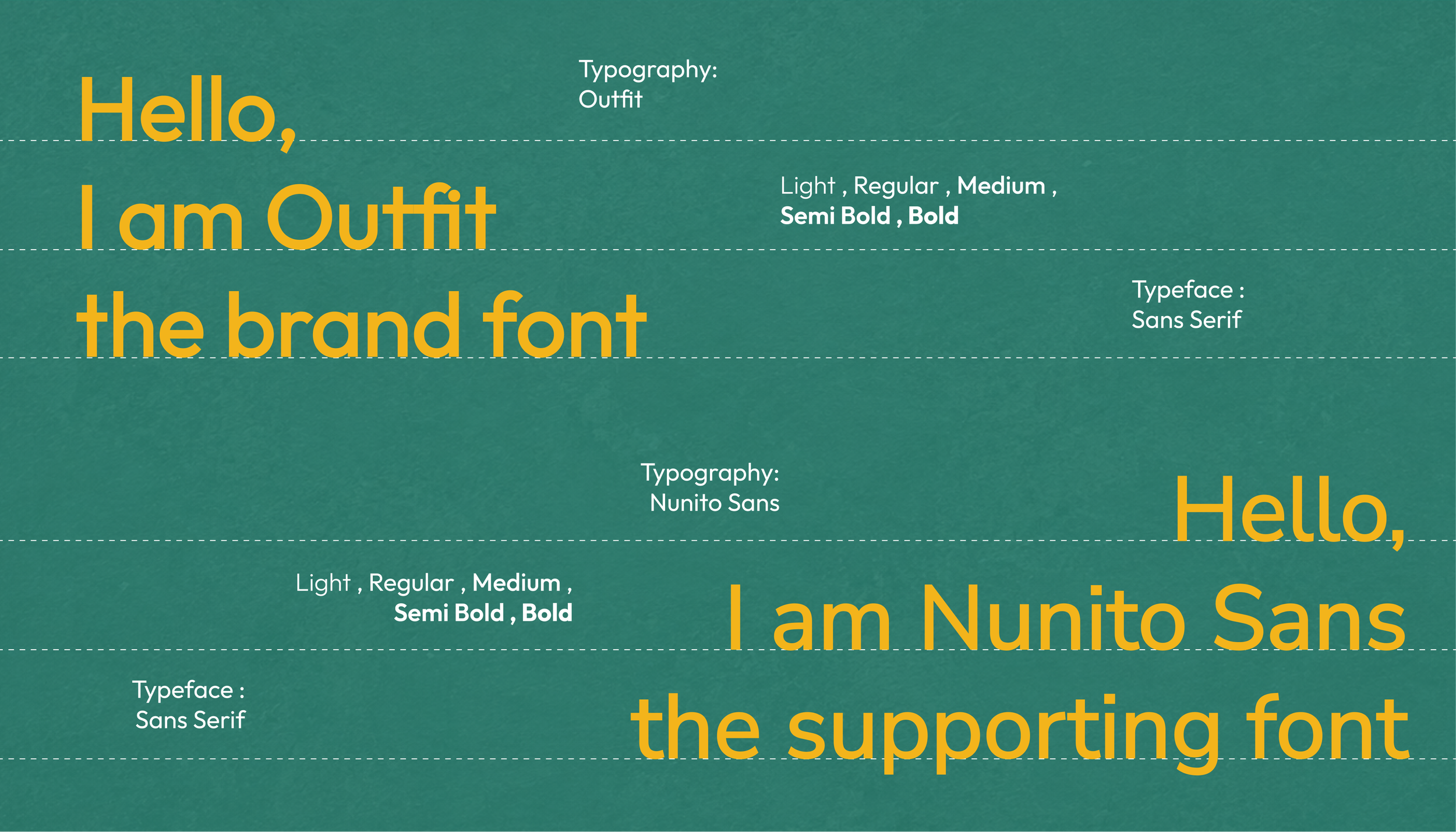
Outfit was selected as the primary brand typeface. Its geometric, contemporary sans-serif construction gives Bharat Ayurvedic Aushdhalaya a cleaner and more modern personality while retaining a friendly visual character.
Nunito Sans works as the supporting typeface for longer communication and functional applications where readability becomes essential.
Together, the fonts create a consistent hierarchy across branding, packaging, advertising, digital platforms and informational communication.
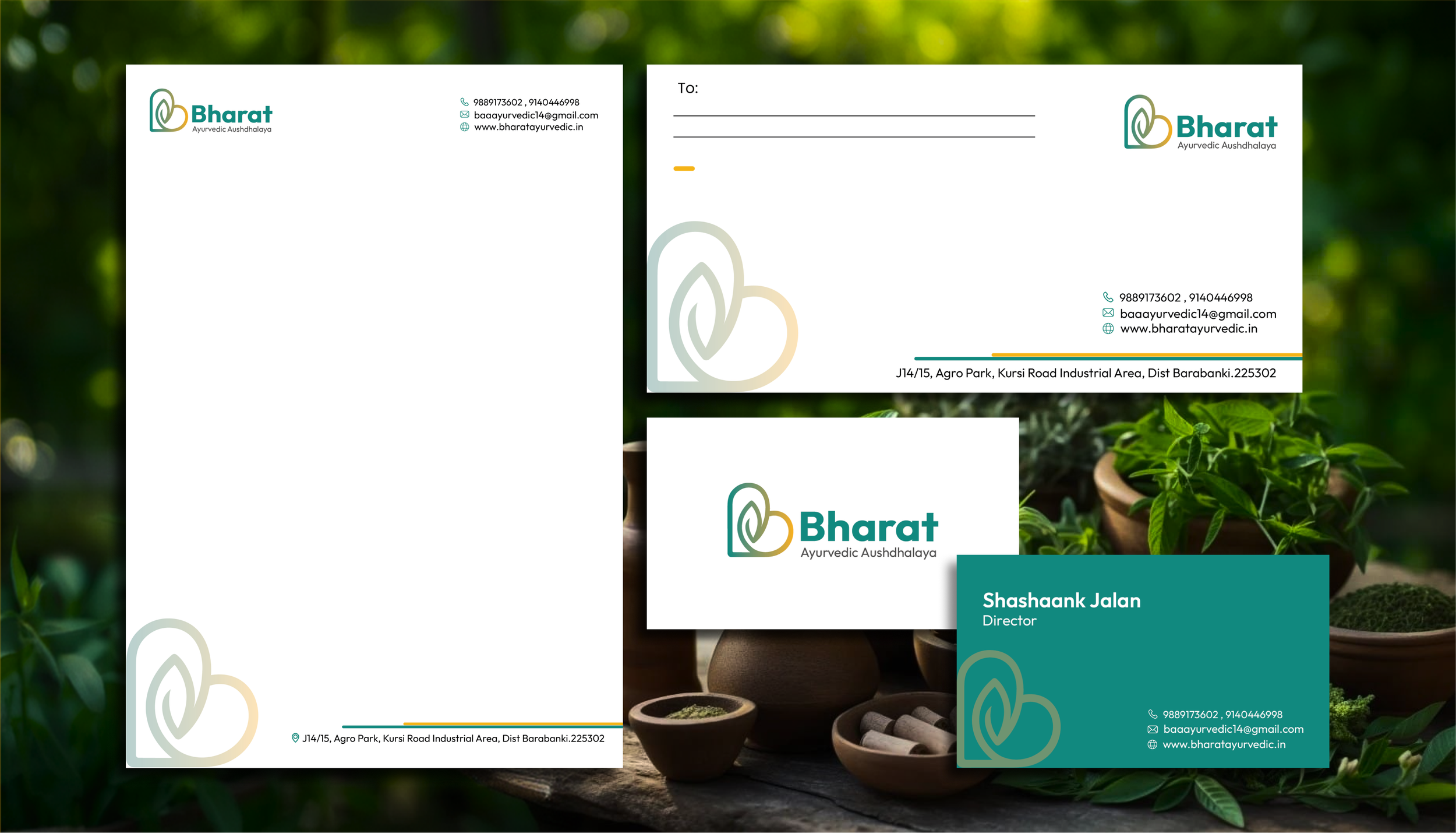
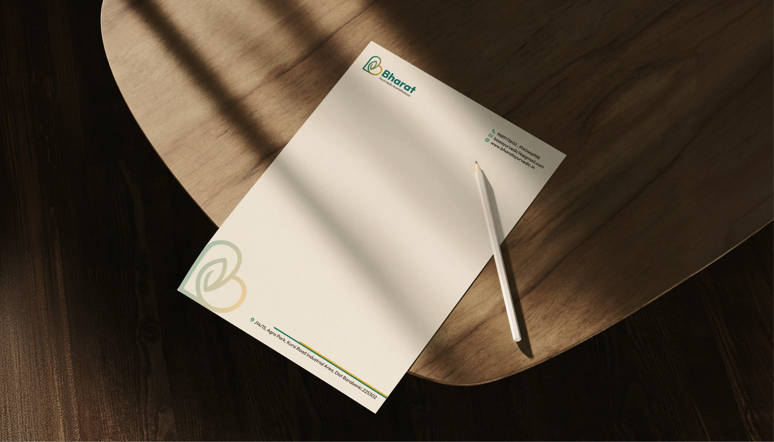
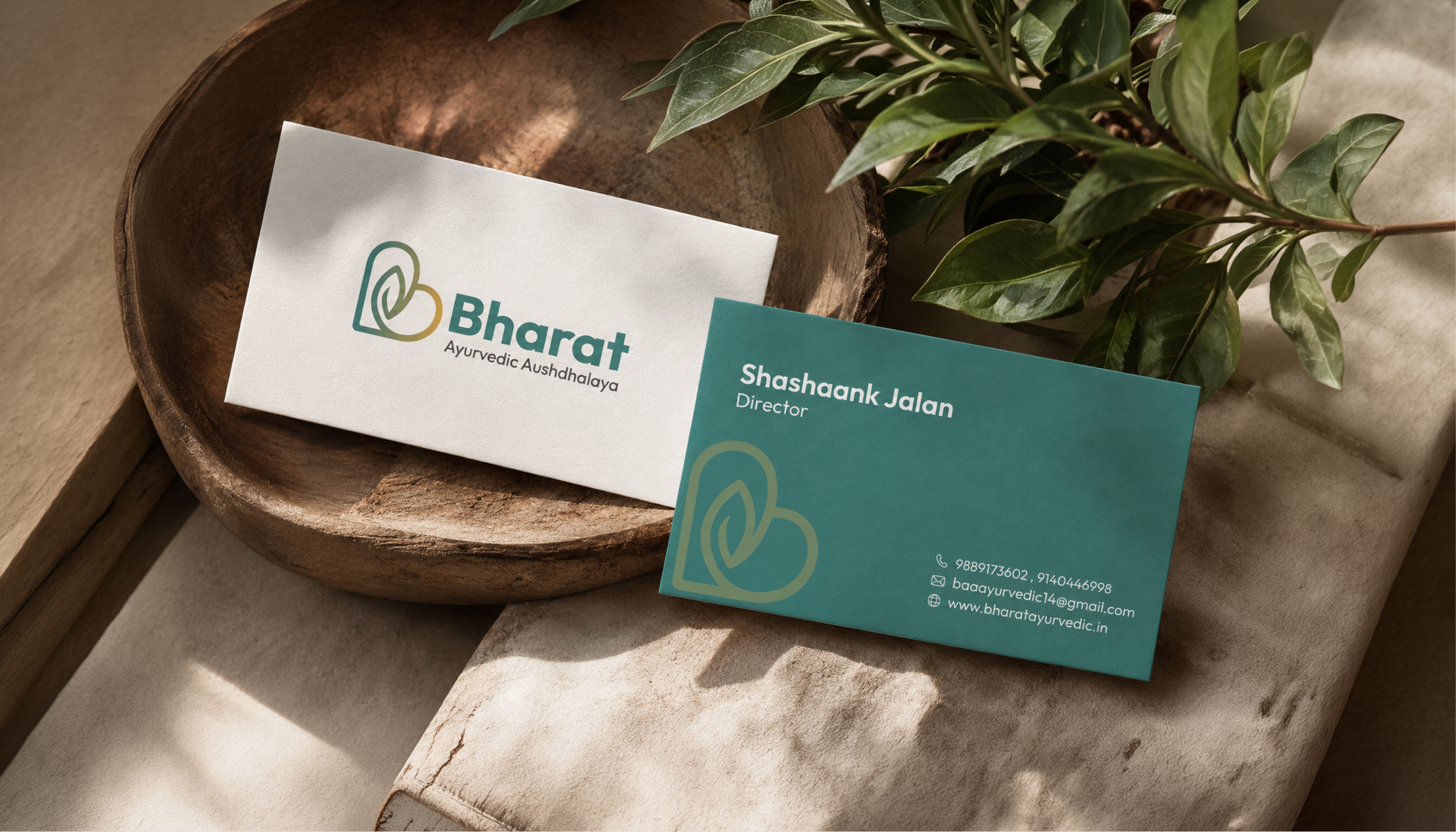
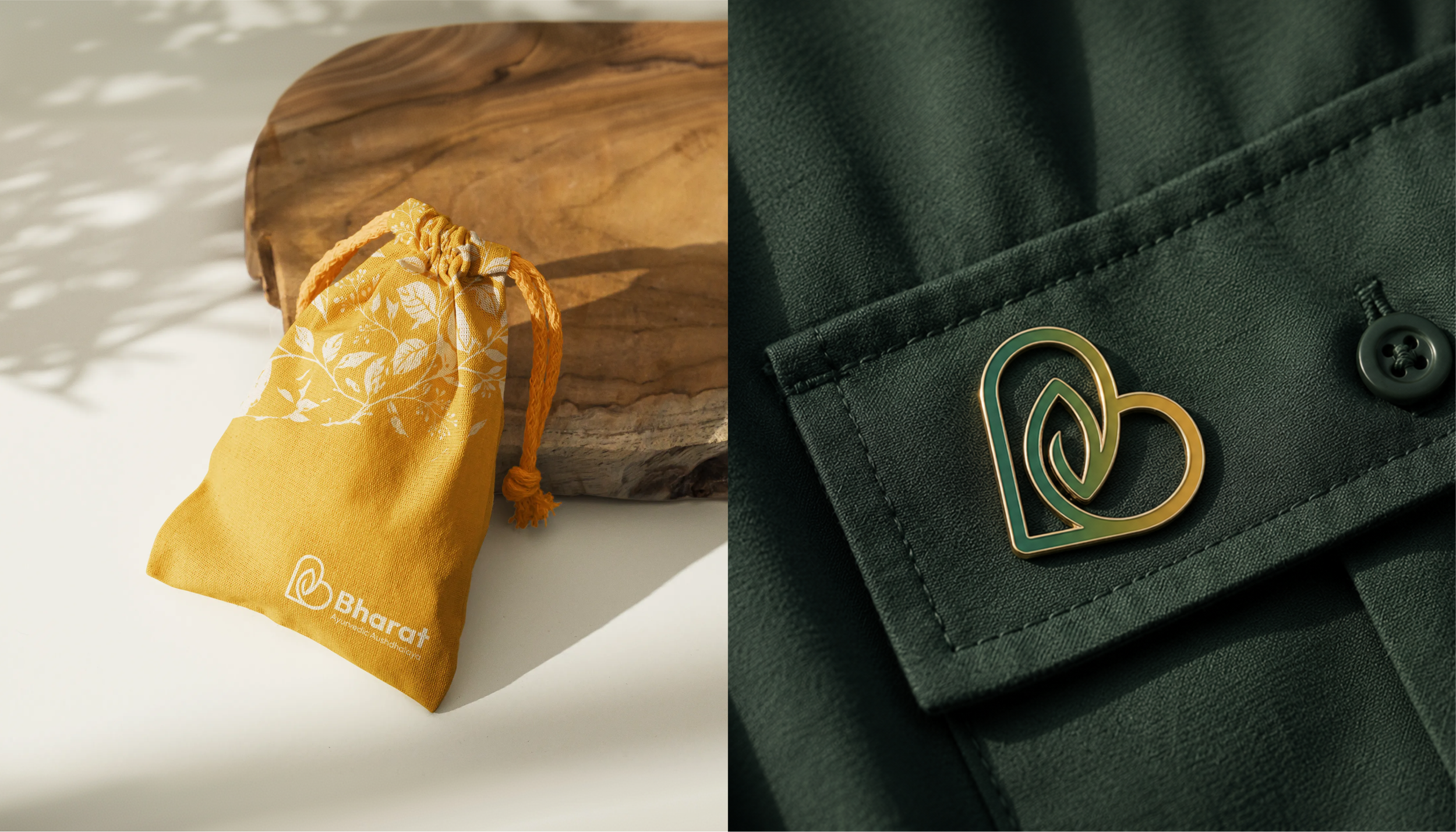
The Outcome
The Bharat Ayurvedic Aushdhalaya rebranding transforms the brand from a primarily traditional Ayurvedic identity into a more contemporary health and wellness brand rooted in Indian Ayurvedic heritage.
Rather than replacing tradition with modernity, the project creates a bridge between the two.
The new identity retains the credibility of Ayurveda while introducing a visual language that feels cleaner, warmer, more expressive and better suited to contemporary consumers.
For Awesome Sauce Creative, the project represents an approach to Ayurvedic and wellness branding where strategy precedes aesthetics. Every element — from the heart-and-leaf logo to the colour palette and photographic language — was designed to communicate the same central idea:
Traditional wisdom can remain authentic while evolving for a modern world.

Who designed the new Bharat Ayurvedic Aushdhalaya brand identity?
The Bharat Ayurvedic Aushdhalaya rebranding and visual identity was created by Awesome Sauce Creative, with a focus on combining traditional Ayurvedic heritage with contemporary wellness branding.
What does the Bharat Ayurvedic Aushdhalaya logo represent?
The logo combines a heart, leaf and the letter B. The heart represents care and wellbeing, the leaf represents Ayurveda and natural healing, while the complete form creates a distinctive connection with the Bharat name.
What was the objective of the Bharat Ayurvedic Aushdhalaya rebranding?
The objective was to modernise the brand without losing its Ayurvedic authenticity, creating a scalable visual identity suitable for contemporary healthcare and wellness consumers.
What was included in the rebranding project?
The project included brand direction, logo identity, colour system, typography, visual language, photography direction and brand applications designed to create a consistent and recognisable identity across multiple consumer touchpoints.
